Quantcast
Channel: tonytextures.com
Viewing all 23 articles
Browse latest View live

Post Production of 3D Architectural Rendering with Trees and People Entourage – Gimp Tutorial

$
0
0

00_Gimp-Tutorial-Add-Trees-People-Architecture-Rendering

This Gimp tutorial about architectural visualization was created by Janedo. Enjoy it!

In this tutorial I want to show you my typical steps I take when I want to enhance the quality of a 3d rendered image. To get a nice architectural illustration within a short time frame I usually combine a 3d modeling and rendering tool with the possibilities of The Gimp or Photoshop. Here I want to share my approach with you.

Import 3D Architectural Rendering from Artlantis into Gimp

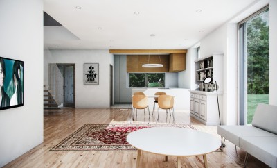
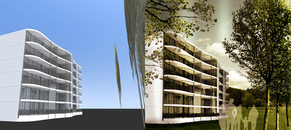
I modeled my building in AutoCAD, imported it to Artlantis to add some basic textures and lightning effects with relatively low effort. The result of this first step looks like this:

01_Artlantis-Architectural-Rendering-for-Gimp-Import

I use Gimp because the features are comparable to Adobe Photoshop, but Gimp is free! Of course if you are used to Photoshop you need some time to make the switch, but I am using it now for years and really like it.

First things first, my building looks like the tower of Pisa, and although the perspective is correct given the chosen viewpoint, it’s going to be really difficult adding trees, people, vegetation or anything else if I try to respect this angle, so I’ll start by straightening my image.

Start with Perspective Corrections in Gimp

First I select with the rectangular select tool (R) the area I want to edit, and use the perspective transformation tool (shift + P) to straighten up the edges of my building.

02_Perspective-Correction-Gimp-of-Rendering

Replacing the sky background of the 3d rendering

Now I’m going to get rid of the original background. As it’s all blue, it’s quite simple, all I have to do is select a region of colour with the contiguous selection tool (U), play around with the Threshold of the selection.

03_Selecting-Sky-Background-Area-in-Gimp

Sometimes the borders between the preset background and the image aren’t bold enough, so it may be necessary to zoom in an add/subtract parts to the selection (to add hold down shift and to subtract hold down ctrl).

04_Add-Subract-Elements

05_Edit-Selection-in-Detail

Now the background is selected. Before deleting it I like to enlarge the selection by a pixel:

06_Enlarge-Selection-of-Background-in-GIMP

Afterwards soften it by a pixel:

07_Soften-Selection-in-Gimp

This will avoid jagged edges and a thin border of background around the building. This step is VERY important. As the building is mainly white, once I lose the selection, I won’t be able to find it again, so I’m going to isolate the image from the blank background and put it onto a new layer. To do this all I have to do is invert the selection (ctrl + I), cut (ctrl + X) and paste (ctrl + V), then give the layer a new name.

08_Copy-Isolated-Building-on-separate-Layer

Add a grass texture to the rendering

Then I am adding a background and foreground to the image using textures from our huge free texture library with over 4000 textures for architectural visualization projects. Afterwards I will correct the perspective and adding a few “flaws” to the final image that are naturally present in photos to make it realistic.

To do so I’m going to add the image I want to use for the grass. I browsed though our huge free texture library and found one nice photo with a perspective area of grass. I can open the new image as a separate layer (ctrl + alt + O), double click and drag that layer behind the building layer (underneath in the list of layers).

Now all I have to do is change the size if necessary (ctrl + T), reposition it, and delete the part I don’t want (R to select and ctrl + X to delete).

09_Rendered-3d-image-with-perspective-grass-texture

Now I am going to add some little tufts of grass to the bottom of my building, as the main thing that makes an image look fake is it’s lack of defects. You will never see a completely straight edge or a perfect shade of white in real life! So to add those little bits of grass, I have to add a mask to the layer containing the building, and this will enable me to do what I could achieve using the eraser tool, without any of the changes being permanent and therefore ruining the original image.

10_Add-layer-mask-in-gimp

Next to the building layer, the mask has appeared. I can paint onto this mask using black, white or grey to achieve different levels of transparency (making the layer underneath, here it’s the grass, appear through the building). Just make sure to click on the mask and not the actual layer before you start painting away. I also found a brush that already looks a bit like grass, so I’m using that, varying the opacity. Don’t go over the top, as you’ll see especially later, these flaws we’re adding look most convincing when you can’t actually tell they’re there, it’s all needs to be subtle!

11_Create-a-realistic-edge-of-the-grass-texture-and-3d-building

Adding a horizon texture to the architectural illustration

Now I’m going to add the horizon. Therefore I picked a texture of a horizon with some grass at the bottom some nice green trees and a blue sky. The next important step is to try to make the different shades of grass in both textures look nearly the same, as if it was one image.

12_Added-horizont-texture-that-needs-to-be-merged

To do that I’m going to play around with the saturation, the luminosity and the contrast, but trying to get the two images to the same colour and intensity has made them rather dull, so now I have to liven them up a bit.

13_Changing-luminosity-in-Gimp

14_Changing-contrast-in-Gimp

I’m gonna add a coloured filter to each of the two layers. I do this by copy and pasting a layer, and have one layer directly over the top of the other. I then change the mode of the above layer to superpose and colorify it.

15_Colorize-the-architectural-rendering-in-Gimp

Here I chose a vibrant yellow. Once I’ve done that to both layers I play around with the opacity of these filter layers to find the perfect blend, and then right click each of them and choose “flatten

down layer”. Now I’ve gone back to one layer per element, which makes things less complicated.

There’s still a discontinuity between both layers though, and for this I use the eraser tool (shift + E) with suffice and play around with size, shape and opacity again. Doing so I can make both layers blend into one another.

16_Blending_Tree_layer_with_Background_GIMP

After deleting the portion of sky in the horizon that won’t be needed, I can add my chosen sky as a new layer. To simplify the list of layers even more I can apply the effect of the layer mask to the layer making it permanent.

17_Apply_the_effect_of_the_layer_mask

Adding the same sort of coloured filter to the other elements of the photo can make the overall look of the image more harmoniously, especially as the colours from the original 3D rendering are very harsh and far to pure. So the sky is too dominant from my point of view so I will reduce the saturation a bit:

18_Reduce_Sky_Background_Saturation_Gimp

Another flaw I can add to the images is a camera focus effect. Decide on which layer of the scene you want to focus on (here I choose the background), and make the other planes (the foreground) ever so slightly blurred. Remember to feather the selection. Instead of one pixel rather go for a bigger number depending on your resolution. Here I’m in 300 dpi so I will choose 400 pixels. Then there aren’t any noticeable or abrupt transitions from clear to blurred parts of the image.

19_Add_Blur_Effect_To_Soft_Selection

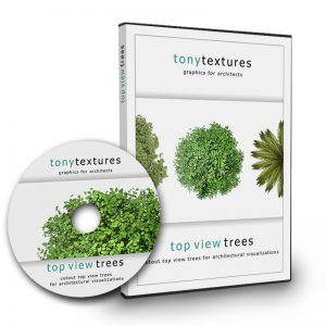
Now I’m going to add some branches and a few trees. Here I use the tonytextures trees, because they already have a transparent background, so you do not need to spend ages cutting them out. Just import them and they are ready to use and additionally come up with a pretty high resolution. Be careful about knowing where your light source comes from in the picture. Mine comes from the right side of the photo, therefore this tree needs to be flipped horizontally (layer -> transform -> horizontal mirror).

20_Cutout_Tree_Architecture_Visualization_Gimp

The main element of your image is the building itself! Therefore be sure that anything in front of it is slightly transparent or showcases the most attractive elements of it.

21_Reduce_Transparency_of_Objects_in_Front_of_Architecture

The last step (and most fun) is to add even more little imperfections to the overall image. With shift + D you can lighten or darken parts of the image, adding shadow, sunlight and effects like this. Here I lightened some of the windows, the right hand side of the trees, darkening the left side, darkened the ground around the building and the side wall that was far too white. I toned down the brightness of the branches on the left and put the contrast up on the right where the sun would hit the trees.

22_Make_Parts_darker_and_brighter

Once you’ve flattened the image you can crop it. I also added a few discreet sun glares in the sky with a simple feathered selection and a change of luminosity and contrast.

23_Crop_Image_in_Gimp

Finally: We made it! You’ve changed a cold harsh 3d rendering into a cheerful photo quality image that you can now use for your architectural presentation!

24_Exterior-Architecture-Rendering_Before_After

If you like it please drop me a line in the comment box!

Thank you!


Combine architecture rendering with hand drawn sketch effect

$
0
0

Tutorial Merge Architecture Illustration and Hand Sketch

This time we like to share with you  a beginners tutorial from Megan about merging a sketch effect with your architecture rendering of an interior scenery. Enjoy it!

With growing impact of technology architectural renderings have become increasingly digital. This transition has been positive as it can save time and provide an increasingly realistic view of a final product. With all of the benefits of digital rendering, hand rendering is becoming a lost art.

While it will probably never be practical again to spend hours elbow deep in paint or markers. Bringing a touch of your own hand back into an image can add depth and interest and help indicate to your client that this is a representation and not the final product. I am here to show you how to quickly bring a hand drawn element back into your work without sacrificing time.

Get your architecture rendering ready

First you will need to create a base rendering, for mine I used Google SketchUp in combination with the rendering program V-Ray and then edited it in Photoshop. However you can use any program to get to this stage. From here we will add your hand drawn element. Treat this as if your rendering were finished so if you want to add any scale figures, details or textures in Photoshop do it now before you print your rendering, that way they can also be enhanced by the hand sketching!

Sketchup Architecture Illustration

Sketch overtop

In order to bring a hand drawn quality to your renderings you must first get them out of the computer. This print does not have to be large or high quality, a standard A4 sheet of paper will do. You can use either a pencil or felt tip, just make sure if your using pencil that you push hard enough so the lines are clear and dark. Here’s the fun part once it’s printed you can grab your trace and start sketching.

Loosely trace over your rendering, here is your chance to add your own personal style. Don’t try and make it look perfect. The goal here is to add a sketchy quality to your rendering so keep loose and enjoy the imperfections. Look for areas of the drawing that look too pristine and sketch over them. You should focus on what the important characteristics of the building are and use this as an opportunity to emphasize certain elements while adding texture and style.

Create a hand sketched layer for your rendeirng

Import the hand sketch into Photoshop

Once you are satisfied with your drawing you will need to scan it to take it back into the digital realm, I scanned mine at 300 Dpi. Once you have your rough sketch on the computer you will need to open it up in Photoshop. Don’t open it directly into your existing rendering as it will need to be edited on it’s own first. You can do this several ways but the easiest is to locate your file on your computer, right click on it select open with and then click Photoshop. If your file was a PDF, like mine after you scanned it will prompt you with a dialogue box…


Import sketch scan into Photoshop

…this is normal, just click okay. Once you have your sketch open you will need to unlock the existing layer it is on. You can do this by dragging the lock located next to the layer to the garbage symbol below it

05_Unlocking The Layer

Adjust the levels of the hand sketch

You will want to adjust your levels so that there is the maximum contrast between your trace and pencil. This is will make it easier for the magic wand select the areas you want to get rid of. You will do this by going to the right hand portion of your screen under adjustments. Then select levels now drag your left curser that affects the lightest tones in your photo over to the right until it is at the edge of the curve above. This will turn your pencil lines as dark as possible without making the trace too dark so that the computer can still distinguish them.


Level Adjustments in Photoshop

Merging the layers of your illustration

Once you have adjusted the levels on your drawing it will have created a new layer, it is important to flatten these two layers before we continue. You can do this by going to the layer tab on your screen right clicking on any of the layers you have and select merge visible. 


Merge the layers

Like the name says this command will flatten any visible layers, since you only have two layers in this drawing and you would like to merge them together, go ahead and press the button. However, be careful if you are to use this feature in the future and you do not wish to merge all of your layers. Make sure that you click the eye button next to any layers you do not wish to merge, making them invisible, before continuing.

Delete the trace

Now we must get rid of all of the background trace texture before we can bring the sketch over top of our rendering. Make sure your layer is still unlocked, if isn’t then when we delete the trace paper Photoshop will replace it with a white background and we will still not be able to add it to our rendering. Click on the magic wand tool …

580-08_Magic Wand Tool_1

and then click anywhere on the trace paper in your drawing, finally press delete. You should begin to see a grey-checkered background behind your pencil sketch. You may also want to change the tolerance of your magic wand; currently mine is set at 20. 

580-09_Magic Wand Tool 2

Raising the tolerance tells Photoshop that you want to pick a wider range of tones, so it will collect darker areas of trace. Continue to use the magic wand by clicking on all of the trace paper colored areas of your drawing until you only see your sketched lines.

Bring it overtop of your rendering

 Once you have deleted all of the trace it is time to bring your sketch into your rendering. You can do this in two different ways.

  1.  You can highlight your entire sketched image with the rectangular marquee tool and press command c to copy your image, then open up the file you want to place it in and press command v to paste it into that file.
  2. You can click the move tool grabbing your image and drag it into the new file by moving the arrow up to the top of the screen then hovering over the tab you would like to bring it into. This will then open up that file taking the hand sketch with it.

Scale your sketch

You may need to scale the image now, as scanning it will likely have altered the size of your sketch compared to the original rendering. Make sure that you are on the correct layer; you may want to name it to keep things straight. You can rename your layer by double clicking on the layers name, for example layer 25 a text box should appear and then you can simply type in the desired name. To resize the image press command T allowing you to transform the layer. You should only need to scale the image, as everything should already be proportionate. Grab one of the rectangular corner toggles, pressing shift to ensure that everything stays proportionate. 

Resizing the illustration in Adobe Photoshop

Once you have the drawing appropriately sized and the sketch lines up with the rendering underneath then apply the transformation. If something is not perfectly overlapping where you thought it would don’t worry, this may even add to the appeal of the hand drawn layer. 

 Sketch Over Architecture Rendering

Make it opaque

The dark pencil lines are probably looking a little harsh on your drawing right now, but that’s an easy fix all you need to do is turn down the opacity. Go back to your layers and select the layer with your sketch on it, if it is selected it should appear blue. Above your layers there should be an opacity button; turn down the opacity until you have the desired effect. Mine is set at 35%, but yours might be different depending on the desired intensity and how dark your lines were after you used the levels tool in the original sketch file. 

 12_Chaning the Opacity

You’re done!

Now you’re done all you need to do is flatten your image to make it smaller for printing or using in other programs. To do this simply go to the top left hand corner of the screen and select file > save as then a dialogue box should appear click where it says Photoshop and change the file type to either a Jpeg or Tiff. This will reduce the file size and speed up using or printing this file in the future. There you have it a quick way to add in a hand drawn appeal to any rendering!

Final Architecture Illustration with Skech Effect

Tutorial Architecture Rendering: Simple 3D Model + Photoshop

$
0
0

Architecture Tutorial Photoshop

I am very happy to present you this time a tutorial on architecture visualization by Armir Shapallo and Dimitrios Kalemis from the  “PHORMIN – Architektur und Digitale Kunst” , based in Munich, Germany.

They describe their work for a competition which was actually published several times! Interesting is the fact that they worked with a quite simple 3D Model and put in more effort in the post production with Photoshop which gave them a lot of flexbility as they describe.

Background and architectural idea

We would like to present you in this tutorial the most important steps to create your digital visualization of the “Pilgrim Tower”. Here we want to set the focus rather on the creative and artistic approach than on the technical know how.

The work was created for an international creative competition “Unbuilt Visions” where the act of pilgrimage should be expressed in an architectural concept. Obviously the project is influenced by a philosophical idea and borders on utopial.

The following examples of architecture influenced our creative design process. We looked for landscape photos and mystic locations. We decided at the very beginning that the final image most important element will be the tower, the landscape and the people.

01_Inspiration-Images-Architecture-Design

To develop a sculptural idea of pilgrimage we collected a lot of images and photos which should stand for the athmosphere to support our creative process. The painting “La tour de Babel” from Joos II De Momper (17th century) inspired us the most starting from the early design process all the way to the final images.

04_Creative-Inspiration

Joos II De Momper (1564-1635),
Quelle: http://commons.wikimedia.org/wiki/File:Joos_De_Momper_-_La_tour_de_Babel.JPG

Simple modelling in Rhino 3D

We decided to use Rhino 3D for the modelling process because the tool offers a lot of flexibility when it comes to creating free and creative shapes and forms. We concentrated here on the building fascade, construcion and the ramps as vertical connections.

Architectural modelling rhino 3D

The defintion of the perspective view is quite important for the final image. Most of the time 3D artists concentrate on modelling directly with one main perspective view in mind, which is a limitation when it comes to pick a proper view at the end. We prefer to directly model the building completely to be flexible in the later project stages.

architecture modelling

Rendering with Cinema 4D and Vray

After modelling the building in Rhino 3D we use for the next phases – the visualization – Cinema 4D in combination with the render engine Vray. The following screenshots show the most relevant render settings which were defined in Cinema 4D and Vray. As you can see the settings are quite basic. We try to keep it as simple as possible when it comes to architectural visualizations for competitions simply due to the lack of time.

05_3D-Architecture-CAD-in-Cinema4D_580

05_Render-Settings-Cinema4D-Vray-Architecture-Visualization_580

Flexibility by rendering building elements seperately

We choosed to render the different parts of the building seperately with alpha channel and merged them later in Photoshop. This gave us a lot of flexibility to change the look of the image in Photoshop without any additional work.

06_Render-Building-Elements-to-Layer-Photoshop_580

Merging building layer in Photoshop

We put together the single renderings in Photoshop by useing the eraser and different kind of brushes. We also played around with the opacity of the layers to test the look of the image. We found that this was a very effective way of the design process because you got instant results!

07_Overlay-Layer-Photoshop-Retouche_580

08_Architectural-Rendering-Elements-mix-in-Photoshop_580

Testing Materials with the help of Photoshop

We still had a key problem: The material of the tower! Based on our design process we thought on some kind of mud-walled architecture, but it would have been too time consuming to render all the images again. So we decided to change the color and overall look in Photoshop. This was really helpful because you have a lot of flexibility in Photoshop to test and find the best color.

Obviously you have more options when it comes to materials, textures, reflections and light settings, but for our kind of building and visualization this approach in photoshop was perfect.

09_Methodology-Material-Textures-Photoshop-Architecture_580

Merging architecture with landscape

The location is a very important element of the complete idea and should support the sculptural character of the tower. It was hard for us to find good background images online that stood for the landscape we had in our mind. Luckily one of our friends – a photographer – supported us with some great photos he took in Albania. We only had to change minor things and recognized that these images support our idea perfectly. Big thanks therefore to Enri Canja: www.enricanaj.com

10_Background-Image-For-Architecture-Rendering_580

To place the tower on the right side of the image was a very conscious decision. The human eye is used to look from the left to the right side in our culture area. If an object is located at the right side it will be seen as more important which results in an more harmonious image.
Now we had the tower and the landscape which was a key element as well. The only missing part were the pilgrims! We found quite a lot of good images that could be used for our images so we used these to merge it with our scenery. With all the different kind of people the image supports a feeling of cultural diversity.

12_Additional-Photoshop-Effects-Architecture_580

We added several more effects with the clouded sky, the mountain top, the foggy city and the blurred rotation of a crowd at the bottom of the tower. We tried to create a “human landscape” in front of the tower in combination with a surreal athmosphere.

For the final image we only made some adjustments regarding color, contrast, satturation etc.
13_Final-Photoshop-Result-Tutorial_580

Here you see two images that give a detailed look on two important parts of the image:

14_Deatails-of-Architecture-Rendering_580

To turn an idea into an architectural visualization like this not only the technical know how is important, but even more the skill develop a strong idea. For this process we used exemplary images and a visual vision from the very beginning which helped us to create this special athosphere for an architectural concept.

Find more images of the project at our website over at:
www.phormin.de
We really hope that you like this tutorial!
The Phormin Team,
Armir Shapllo, Dimitrios Kalemis

15_Architectural-Visualization-Studio_Phormin_580

Architecture Rendering – Quick Realistic Grass in Sketchup (Tutorial)

$
0
0

Sketchup Tutorial Architecture Grass Carpet

When talking about photorealistic architecture renderings, one of the key elements is the use of vegetation – simply to bring life your scenery… In this Sketchup tutorial I am going to show you how to create a quite realistic grass with the help of a good texture. So I do not use fancy fur plugins or other rather complex solutions (that without a doubt create very good results) but rather follow on a quick and easy apporach here to not at least present a solution with reasonable overall project and rendering time.

The basics of working with vegetation

If you are wondering where to start, a good way is to check your material library in order to have the proper grass textures for the work.
At our free tonytextures texture gallery you will find plenty of grass textures for you to choose:

Free Texture Gallery Architecture Tonytextures

What you need to keep in mind is that textures don’t need to be as big as 2mb files. Just with a normal size texture (around 800 kb) is more than enough. Why? Because big size textures will only add more “weight” to your scene; and that can be annoying especially if you have too many polygons at your scene for rendering. Sometimes using a big size texture can only bring you a headache, and mostly because it will look out of scale and you will lose time in adjusting its scale for adapting the texture for your work. You simply do only need a large texture if your camera will be very (I mean very very) close to the textured material..

For the next steps of this tutorial I am going to work with this texture below found at tonytextures. It is quite even without too many different looks over the area, but looks realistic – all in all a very good texture to use for architecture renderings etc. By the way: You are free to use exactly this one also for your projects (even commercial) so make sure to check out our extensive photo texture libary.

Grass ground texture free

As you can see, the file size is 707 kb! Totally ok for our use!

Starting with our Architecture Scenery in Sketchup

Let’s open Sketchup and create a plane for applying the texture. For this tutorial I am using Sketchup Pro 2013 + Vray 2.0

01_sketchup_setting-plane_580

After creating the plane, let’s extrude it a little bit. This way, when the material is applied, it would look like as a grass-carpet.

02_sketchup_plane_extruded_580

Give the height you feel comfortable with. But notice it needs to be in proper proportions to the other geometry of your model, otherwise it won’t give that “real feeling”.

Assigning Realistic Grass Texture to the Ground Plane

First we will open the texture for using it in our model. We go to File>Import and retrieve the location of the texture file. It is very important that you remember to tick the option “Use as a texture” before loading it into the scene.

03_sketchup_import

04_sketchup_select_a_grass_texture

After selecting that option and loading the texture, you will notice that the texture will show up as an image in the viewport, allowing you to click wherever you want to apply it. But… surprise! After clicking the mouse is going to work into the scale mode for the texture; something that can be really important for tiled textures, which in this case is not something to worry about.
Give it a small scale as I show in the next image, and then click again. That will apply the texture to that very face.

05_sketchup_scaling_texture_580

As you can see in the image below, I also applied the texture to the other faces of the extruded plane. You can retrieve the texture by using the native material editor of Sketchup (the paint bucket tool) and click the eyedrop tool for getting the material to the editor.
Also you can adjust the size of the texture. This is the trickiest part of the whole work! For me, a good way of looking if a texture is out of scale, mostly with grass textures, is zooming in and checking the size of the grass itself. If it looks too big for the plane, then reduce the size of the texture. In most cases, unfortunately you will realize your texture is either too small or too big while rendering (yeah, it sucks, but Sketchup viewport doesn’t always shows what the end result will be).

06_sketchup_native_material_editor_580

If you want, you can change the hue of the texture itself in this material editor, as well as the texture opacity. In this case it won’t be needed.

Use the Vray Material Editor

Next I will open the Vray Material Editor.

07_sketchup_vray_material_editor_580

After selecting the material we are going to work with, I ticked both Preview and Live Update for looking the material appearance while making changes to it

08_sketchup_vray_material_editor_diffuse_580

When clicking at the “M” next to the diffuse color slot it will show the options for the loaded texture. This is helpful if you don’t feel comfortable with the texture you chose, and you want to replace it, or if you want to alter the Blur or Gamma values of the texture. For this tutorial I won’t alter any of this default values.
The OPTIONS tab can be hidden by now for working more fluently. Now it’s time to add some Bump to the material we are creating.

09_sketchup_vray_bump_map_580

Adding a Bump Map

For the bump map I am going to create a blend map of noise.
The elements necessary for this blend map is:

  1. A Noise map
  2. A Bitmap texture of noise

The parameters for the noise map are the following

  • Type: TexNoise (Noise for older versions of Vray)
  • Amplitude: 6
  • Size: 25

10_sketchup_vray_bump_blend_small

As for the bitmap is just using TexBitmap in the 2nd material slot of the Blend Material. In my case I will use this noise texture:

noise_texture_for_grass

Add a displacement map

Next we need to add displacement for this material. A displacement map will deform the textured object based on the greyscale information of your displacement map. A good way to add a 3D touch to a flat object.

One important thing before following: If your PC is not a high-powered build then skip this step. Displacement can give a realistic feel but it REALLY increases rendering time. Given the size of your scene and the area where the texture with displacement is applied, you can notice differences of more than 5 minutes in common quality rendering time. Not to mention if you are using high quality settings or if there are already another or many other materials with displacement in their composition.
For the displacement, we are going to do the same as with the Bump map. A blend material, although this time we won’t use a texture, just the blend of two noise maps with different values.

First material in blend:

  • TexNoise map
  • Amplitude: 1
  • Size: 25

Second material in blend:

  •   TexNoise map
  • Amplitude: 1
  • Size: 0,05

After creating this material it is time to adjust the values for both Bump and Displacement multipliers. This part is entirely up to you, I am going to give the Bump multiplier a value of 1,5 and the Displacement a value of 5,0.

Checking result of our grass texture

For ending up with this tutorial I decided to bring back an old model and fit it with the grass plane we created. And this is the result.

render_final_sketchup_grass_texture_580

A common mistake with this kind of grass carpets is to show the tiles of the texture, which happens when the size of the texture is not that big and you want to give a sort of “aerial view” to your scene. If that is your case, there are two choices for fixing it:

  1. Change view point: Instead of an aerial view try for a people-horizon position of the camera
  2. Use a grass plugin generator instead of grass texture

For a common architectural scene where grass is only just environment stuff this is more than enough. Mostly if the PC we are working with is not that powerful or you simply do not have the time for complex stuff. If you want your grass to look more like tall grass, you should check some plugins as FUR for Sketchup; but always remember that when working with plenty amount of detail in your models, also adding some environment stuff such as trees, cars, streetlamps, etc. will load your scene with many elements to render. Tall grass in that case will be a headache as it will significantly multiply the rendering times in order to process all of those elements. You can also always add grass in Photoshop by using some masking techniques.
As for what matters to FUR, if you feel interested in testing the plugin, this is a good tutorial to check:

My advice is to only use FUR if you really have a powerful PC, otherwise Sketchup will crash trying to render your model.
Also try not to bring too much attention to the grass carpet at the scene. That will make the grass look as the main character instead of being the building you worked hours and hours in order to make it pretty and with a realistic fitting background.

Finally: Happy testing! :)

Architecture Visualization Post Production in Photoshop

$
0
0

Post Processing Architecture Visualization

Have you ever looked at a rendering and wondered just how the author creating such an interesting complex space and wished you could do something similar?

I recently found a nice video by Andrei Oprinca on how to make architectural renderings more interesting, complex and realistic. It’s full of great tips that I would like to elaborate on while adding a few of my own. The secret to this type of rendering in Photoshop is to add and keep adding elements to your image until the space looks real. Finding the appropriate stock images can be difficult and it can be time consuming to cut them all out, a great tool to speed up your renderings is to already have a variety of stock images to choose from.

Where to find free stock architecture images

If you want to start building your own archiviz image library or want to increase your existing library – definitely check out our free “openArchiVIZpack” for private and commercial projects:

Free Download Entourage Trees People for Architectural Visualizationcs-for-architectural-visualization

Free Download Entourage Trees People for Architectural Visualization

The collection comes along with a set of ready-to-use cutout billboard elements in PNG format and tileable textures as well. But for visualization like the one we want to show you today you also need a lot of good architecture related stock images. We shooted over 4000 architecture related photos over the last years and published them for you on our website. So feel free and use them for your next private and commercial project:

Architecture-Stock-Images-Free

OK – now that you know where you can get the images you need to start right away – lets take a look at Andrei´s nice tutorial about architecture visualization:

This video emphasizes the importance of having the correct perspectives and lighting to ensure that your renderings look realistic. There are certain tools in Photoshop that can maximize your rendering abilities while minimizing your time and effort and I am writing this article to help you unlock them and make your life easier, so I want to go trough the main functions every architect should know in Photoshop:

Photoshop Masks – A Must for Every User

Masks are one of the best tools in Photoshop. There are two types of masks clipping masks and layer masks. The following images show you the general idea behind it:

Clipping-Mask-1_580Clipping-Mask-2_580Clipping-Mask-3_580

Clipping masks are used to hide part of a drawing without completely removing it. While layer masks are used to change the opacity on part of the layer. There are a few reasons why masks are better than just deleting the part of the drawing that you are not using, first you may find that you need that part of the drawing later and it is difficult if not impossible to retrieve if you have erased it, secondly masks in combinations with an alpha channel can quickly hide the background behind complex imagery like a building saving you hours.

In the video Andrei uses the layer mask tool to hide part of the drawing. He does this by adding a layer mask and then tracing the area where he would like to add grass to with the polygon lasso tool finally he changes the rest of the mask to black isolating the area where he wants to see the grass, while hiding the rest. If you are using layer masks to create clipping masks remember that anything that appears black on your layer mask will be invisible on your layer.

I would suggest using a clipping mask instead of a layer mask to hide portions of a drawing in Photoshop. Using a clipping mask is an easier way to create the same function. In order to use a clipping mask put the layer you would like to hide above the shape you would like to see it in. Then simply go to layer > create clipping mask and it will crop the object above into the shape below.

Adapt Your Images To The Right Perspectives

Having the correct perspective is crucial to creating a realistic rendering. There are a few different ways that you can alter the perspective of an element of your rendering to ensure that your image passes the test:

Vertical/ Horizontal Smart Filters

In order to do this you must first transform whatever layer or object that you would like to alter the perspective of into a smart object. You can do this through Filters > Convert for smart filters. Once you have transformed your layer go back up to filters and click lens correction > custom. This is where you can change either the vertical or horizontal perspective to help get things to start looking the way you want.

Clipping-Mask-2

** These smart filters can also automatically correct the perspective on your photographs! If you go to Auto Correction and then choose the camera lens you shot your photo with it will automatically correct any skewing the lens may have caused!

Perspective Grid

If your like me and have trouble telling if something is in perspective or not this tool will become your new best friend. By creating a new layer then going to filter > vanishing point you can create a guidelines that can help show you what height or distance the objects within will need to be in order to ensure they are the correct perspective. This tool is simple to use just ensure that you pull on the corners until the box turns blue indicating that the lines are in perspective.

**If you’re using CS6 or later you can also easily create a 1-point or 2-point perspective using vanishing points. You do this by selecting shape > polygon, then you will need to change the polygon settings. First alter the amount of sides to 100 then just make sure that you indent your sides to 99% and that ‘star’ is checked. After these settings are set then you can click on the screen and drag out your 1-point perspective.

If you need a 2-point perspective instead you can just as easily create this by repeating these steps but dragging out the 1-point perspective on either side of your image. This will help you to create a series of guides and lines for you to follow making your drawings look more accurate.

Transformation To Change Perspectives

The easiest way to quickly change the perspective of any object is with the transform tool. Just press command T or go to edit > transform > perspective and you can grab the corner and manually adjust the perspective. This tool is great as it is so simple and you have so much control over the process.

Regardless of the tool you use be careful of skewing your perspective too much as that can be the difference between a beautiful and realistic looking image and one that looks just a little off.

Lighting in Architecture Visualization

Lighting is key to making your renderings look realistic, if things are lit from different angles your renderings may look off and be less convincing, even if the viewer is unaware of why. In this video Andrei gives lots of tips how to alter or add light and shadow to a rendering. Here I am going to focus on a few of my favorite.

Dodge/ Burn

The Dodge and Burn tools are great to help add shade and shadow and create depth within a drawing.

Dodge and Burn Tool

To dodge means to add light to a certain area and to burn means to add shade or darken an area. These tools can be found in your tool bar on the left hand side. Once you have decided where you would like to add high or lowlights to your drawing you can adjust the size and hardness of the tool. Remember the harder your brush the sharper your edges will be. Then just click and hold down on the area you would like to alter.

Creating a shadow

Sometimes you have found the perfect element but it doesn’t come with a shadow. Don’t worry it is easy to create your own! This trick is also great if you are creating a rendering at dusk or dawn and you need to add long drawn out shadows. First you need to turn the element black, you can do this by highlighting the object using the magnetic lasso tool and then on a new layer and use your paint bucket to fill in the area. Once you have the same image in a completely solid color you can change the opacity so that it looks more like a shadow. Lastly all you need to do is use the transform feature to change the perspective to reflect where the actual shadow would lie.

Gradient

One of my favorite and easiest tools to add shade and shadow into a drawing helping make it look more realistic is the gradient tool. If you have an area of a building or built element that would realistically cast shade but the shade does not necessarily have to look like the actual object itself then this is perfect. I like to put my shadows on a new layer and adjust the opacity of the layer however you can also adjust the opacity right in your gradient opacity at the top of your screen. Now All you need to do is use the polygon lasso tool to highlight the area you would like to have shaded then go to your gradient tool, which will share the same object as the paint can on your side bar, You will want to have foreground to transparent selected then you just click your curser where the shadow would begin and drag it to wherever you would like it to stop. There you have a simple way to add a shadow.

Gradient Tricks

There you go ensure that your renderings are always in perspective and lit properly while never deleting anything that you may want to use later. Use these simple tricks and keep your renderings looking realistic while saving time and energy!

How To Use FaceMe Tree Components in Sketchup

$
0
0

Architecture-Trees-Sketchup-Components

As we learned using 3d vegetations in Sketchup could bring great results, but slow down the rendering process and overall workflow quite a bit. Often times we need a good result in a reasonable time frame. Here the Sketchup faceme components are ideal to use for trees. The genereal idea is to use a cutout tree image that is mapped on a plane which can be placed in your scenery like a billboard. Why “faceme component”? Because you can define that this plane should always face the camera! This is great because now you do not have to make sure that all the trees you use are aligned to the active camera!

In this tutorial we are going to learn how to use 2d vegetation images as faceme components in sketchup – a must for everybody who is interested in architecture visualization in Sketchup.

How to use 2d vegetation images in Sketchup

You can use plugins to create 3d vegetations in Sketchup like in this example:

3d vegetation models in sketchup

On the other hand 2D vegetation allows us to create beautiful scenes with less RAM consumption. But notice that this only works for 3D Renderings. Animations with 2D vegetation seem like a sin for most designers, as the effect of working with plane 2D image is really obvious when you are rotating the camera view while you move.

In 3D renderings we face another story. 2D vegetation can also reinforce that kind of “instant” effect that we may want for our renderings, as if we took a shot from a distant point of the scene itself, and also tend to not drag as much attention as high detailed 3D models (this of course if the 2D vegetation files are properly used), and also can be used to create unrealistic render-styles; often commonly used in Site Planning renders or even for concept idea renders as they take only 1/10 percent of the time 3D vegetation takes to render.

Choose high quality cutout trees for faceme component

About 70% of the final result of the image, in the case of 2D vegetation, is how well we manage to use the tree textures and how to place them, in order to not feel affected if we want to rotate the camera for taking another angle still shot of the scene.

First of all, 2D vegetation MUST be a high-quality cutout version of a tree/plant for applying it to our scene. Why? The answer can be a one-worded one: Shadows.

When working with 2D vegetation, shadows are an issue. If the model is not detailed enough, then it will lack of the realistic feel of grass leaves casting shadow over the floor and reflecting at the glass planes of our project. Of course if you are not working with photorealistic scenes that is not an issue, quite the contraire.

For scenes where you only want to transmit the idea of how to live that “space”, making a high detailed render can be a huge mistake. Detail level in photorealistic renderings can only drag the user attention form the concept of the project to the graphic results of the project made, and that can really damage the project if we fail to crate photorealistic graphics, as it will end up looking as something we didn’t care enough about in order to present such results.

On the other hand, when the scene almost resembles a toon with some detailed areas, it drags the user attention to the focused points, as an invitation with the efficiency of infographics to learn more about the project rather than to disagree in a first place with the project purposed.

How and where to find 2D cutout trees

Now that you decided you want to work with 2D trees you may ask yourself: “okay, where do I find them?” There are several places, but please take into notice this things first:

  1. Cutout trees must be PNG images
    They need to have transparency, otherwise they will render with white background around and that is completely the opposite to realistic
  2. Reduce the cutout tree image size to your special needs
    If you use several files at the same archive it will only increase the file size and may create problems at rendering like crashing out of RAM
  3. Try to look for good quality 2D trees
    Good quality of leaves, of overall detail. Mostly if the trees are going to be a good part of your project

If you need some free high quality cutout tree or plant images to test just grab our free Open ArchViz Pack, where you can find many cutout trees and plants for free. You are even allowed to use these trees and textures for architecture visualization for your commercial projects!

Free Download Entourage Trees People for Architectural Visualizationcs-for-architectural-visualization

Free Download Entourage Trees People for Architectural Visualization

What are Sketchup face-me objects?

One smart way to work with 2D vegetation in Sketchup is via creating Face-Me Components. But what does that mean and how to achieve it?

Face-Me components are objects that we create via Components in Sketchup, and its more versatile attribute is that they move along with the camera, meaning that wherever we place the camera they are going to be facing us.

This property is extremely useful in renderings, because it tends to happen when we do a render that we ask ourselves: and what if I render the scene from the other side? If it weren’t for Face-Me components, the 2d vegetation would look as a line or a plane without any detail.

Now let’s start creating our Face-Me tree in Sketchup

How to create a tree face-me component?

First I am going to select a cutout vegetation file in order to use it as our Face-Me component

I will use the “CutoutTree_Vol.02_42.png” file from our free Open ArchViz package for this tutorial

Free cutout tree with alpha channel

Then, after choosing which file is going to be our Face-Me model, I can start working within Sketchup.

As this is going to be a render with 2D trees, I prefer to work with 2D grass, in order to avoid giving the trees that sort of “flat” look in comparison with 3D grass.

First import the cutout tree as an image. Adjust the scale of the tree and position it wherever you want in relation to the axis.

02_tree_image_580

Then we right-click the object and apply the Explode option. This way we can then select it and create a new component from the image.

04_how-to-tree-component-sketchup_580

Select the image and create a component from it. Remember to tick the option “Always Face Camera”

How to create realistic shadow for 2d tree face-me components?

tree component in sketchup

And… if you have the shadows visible you will notice a problem… the shadow itself.

Why is this? Well maybe the tree texture doesn’t have a proper alpha channel applied while it was saved and that is the reason why it casts like it. This also happens with JPEG images which doesn’t have any alpha channel. Either way, it can be fixed two ways:

  1. Right click. Edit Component
    With the freehand draw tool, draw a figure around the tree and with right-click + erase, delete the unwanted areas. It may not be a perfect shadow figure but it works well
  2. Open the image in Photoshop and ensure that only the background pixels of the image have transparency set (flatten the image, re-add an alpha layer and select then erase the background); open the Image flat in an empty model and use ImageTrimmer to make the cutout automatically.

For this tutorial, I am sticking with the first method. And this is the result

tree component shadows

real shadow of tree face me component

There is also a good video tutorial about creating shadows for faceme component in Sketchup:

Now it’s time to place the tree and make copies of it in our scene.

Rendering architecture scenery with 2d cutout tree components

Rendering architecture face me component of tree

Now I placed the trees with my model and placed a camera view. One thing to notice prior rendering is that 2D trees may take a bit longer to load in the rendering engine in comparison with 3D trees, but while rendering they do the task faster. It can be an issue if you place several trees as Sketchup may go out of RAM trying to load all elements.

And this is what we get as a result after rendering

2d PNG tree as sketchup face me component

Pretty nice, huh?

If you don’t mind losing a bit of detail in the casted shadows, it’s a really good alternative to 3D models, as they render faster and the possibilities are infinite: just as long as you take the job to find a good image, make an alpha channel and do the steps I mentioned above, you can even have a bigger library than with 3D models.

Also keep in mind that you can make your own trees via hand draw and prepare them as cutout trees. If you scan the images, then maybe it is a bit harder to make the cutout, but after it’s made, you can then, for example, adjust the style of the scene to a sketchy-looking view and then add hand drawn trees in black and white. The result will be almost as if the render was handmade, which is always helpful as another way of showing our work.

SketchUp Plugins for Architecture Modeling and Visualization – Part II

$
0
0

Sketchup Plugins for Architects

SketchUp is a really great tool for architects and quite popular! Therefore we want to present you here some plugins that are helpful especially for architecture modeling and rendering with SketchUp to speed up your workflow and enhance your visualization quality at the same time!

This is the second article on SketchUp plugins for architects. Make sure to check out also the first part here:

Best SketchUp Plugins for Architects – Part I

Now it’s time for learning about some of the best rendering engines for SketchUp, as well as some advanced tools for enhancing your workflow.

Soap Skin & Bubble plugin for tensile structures in SketchUp

This plugin is for creating tensile structures from edges. Also you can use it for creating organic architecture. It is quite simple to use but with amazing results.

First start by creating a 3d object. It is best if you use curved extrusions over extruded rectangles.
Then we delete everything but the 2 curved edges and the edges connecting them, just as in the image below:

 Sketchup Plugin Soap Bubble

 We select every edge and click at Generate Soap Skin

Sketchup Soap Bubble Tutorial

The plugin will ask us how many divisions we want. The more divisions, the more precise the organic shape will be. In this case I chose 25, from a range starting at 10 and ending at 30.

Sketchup Modeling Plugin for Architect

How to use Soap Bubble Sketchup Plugin

After that, hit enter again and the plugin will start generating the shape. It is sort of a rendering, but will considerable less time for achieving results

Start with Soap Bubble

Generating tensile structure

And this is the result

Finished structure

Quite impressive, right? But it’s not finished yet. If we want to apply pressure to this structure, we can do it by clicking the group and then choosing Generate SoapBubble.

The command will ask us how much pressure we want to apply and in which direction. As always, positive values for inflating the shape, negative values for depressing it.

soap bubble pressure plus

Soap bubble pressure minus

How to use Vray in SketchUp?

For me, my favourite rendering engine. It has a learning curve that may be complex for new users, but several changes in Vray for SketchUp on its 2.0 version made easier for beginners to start working with this marvellous tool.

Vray sketchup plugin for architecture renderings

Vray has plenty tools on its own. From a material editor to lighting tools, as well as proxy-creation tools.

As you can see, material editor is quite different than SketchUp native material editor. It has more complex parameters such as reflections and refractions, as well as different kind of maps for creating effects (such as Noise, Cellular, etc) or for illumination conditions (VrayLight, VrayHDRI).

vray architecture material sketchup

Vray Architecture Materials

One advantage is that we can download vray materials from most of the sites around the web. One of my personal favourites is www.vray-materials.de as it has quite the library for almost every kind of scene you may want to create.

vray architecture materials

vray architecture panel

The options panel contains every setting needed for Vray to work properly. For advanced users, setting up the parameters is vital for getting photorealistic results, but beginners may get confused when first looking at this. Maybe because of that, or just for accelerating results, this version of Vray has already loaded a group of Presets for almost every occasion.

Rendering Architecture Exterior Scenes with different lightning settings

The presets are quite good in my opinion. First you select the kind of scene you want to work with (if it is Interior or Exterior Scene, or a Camera preset with tinting options loaded) and then the quality of the rendering itself, but this applies only to Interior/Exterior presets.
Just changing from preset options you can give your scene a completely different “feel”

vray lightning exterior scenery architecture evening

vray architecture outdoor scene sketchup

Also there is an option for making proxies. Extremely useful when working with several identical objects, such as vegetation, cars, benches, etc.

Shaderlight – Easy SketchUp Rendering Plugin

This is another great render engine, easier to use than Vray, and with plenty options for creating interesting stuff.

As you can see, the options are quite few. Just setting the size, the quality, kind of scene, lighting type and the background for the render.

shaderlight settings tutorial

You can render with a good quality with the default values. Of course don’t expect a Vray photorealistic quality, there are different kind of rendering engines as you don’t have as much control in the overall results than what you have in Vray. But for most uses, and when you want to do a fast render, Shaderlight is really powerful.

how to use shaderlight in sketchup

But in my opinion, one of the most useful tools of Shaderlights is the capacity of creating chalk renderings/animations. The option shows at the Lighting rollout, where you select Chalk Render. Its effect reminds me of Ambient Occlusion in Vray, but with only one parameter: Shadow Range.
After selecting Chalk Render, the Shadow Range option comes available. The higher the value, the most noticeable the contrast will be and the darker look of the render. For example, if you use a value of 1 for Shadow Range, the scene will look burned while rendering, because of too much white light on it. Of course the value you want to give to the Shadow Range will depend of your scene: geometry placed into the scene and background.

tutorial shaderlight chalk setup

sketchup rendering chalk shaderlight

It renders much faster than normal-looking renders, and are quite good looking for presentations, as well as for abstract schemes.

Shaderlight light placing tools are quite simple to use: just select the kind of light and click at the place you want light fixtures to be.

Also Shaderlight has an option for Cloud Rendering, which I haven’t tested so I can’t give you any reference on that; but Shaderlight Youtube channel is a good place for start looking if you are interested, as they have many tutorials.

Some general considerations on using plugins

As you may know, there are many plugins around the market. Of course this selection is only according to my opinion and experience of working with them, but you may find some other tools that are useful.

One of the most important things to take into notice before getting plugins is, besides the price, the “power” of your computer. For example, if you have an older build, you may then want to use Shaderlight instead of Vray, as it demands less resources from your computer.

Also take in consideration that plugins that contain many tools, such as 1001bit, even they are really useful and can replace many plugins with only one tool, take time to load. And you will notice that delay when opening SketchUp, as the plugins load all at once, and many of them check licence status before even loading.

Architecture Interior Rendering: Adding and Changing Volume Light in Photoshop

$
0
0

Tutorial How to create volume light in photoshop architecture rendering

In this tutorial I want to touch on a typical task that needs to be mastered when it comes to post processing of an architectural interior scenery with Photoshop. Often times it is faster to change and optimize some lightning effects in Photoshop and not in the rendering tool (like 3DS MAX, Cinema 4D or Rhino..) itself as the rendering process can take quite a bit of time. From my experience the best approach is to start with some proper settings for lightning the interior scenery but the experiment in Photoshop to polish the rendering finally.

I use this rendering of a bathroom for this tutorial:

Tutorial Architecture Visualization Interior

So let’s get started. First it is important to analyze the image and define the “cold” and “warm” areas. As the sunlight determines the atmosphere of our interior architecture scenery the warm light comes from the window – the cold areas are more in the left part of the image.

Lighning cold warm instruction

The arrows show the distribution of cold and warm areas. So what I did next is doing some general image corrections. First I modified the brightness and contrast by using the curves tool (STRG+M). Afterwards I worked on the color temperature of the image. Therefore I add a new fill layer by clicking the button in the bottom of the layer panel.

Photoshop Photo Filter

Here you can use e.g. a “Warming Filter” as the basic image was bit too “cold” from my point of view. You have to play around with these options a bit, but I can highly recommend this approach as it is very flexible and is one of my key tasks to optimize the overall image atmosphere.

To get this kind of blurry effect I followed these steps:

  1. Copy the layer
  2. Apply Gaussian Blur Filter
  3. Change the Layer Blending Mode from „Normal“ to „Soft light“
  4. Reduce the layer opacity of the copied layer a bit

After these basic steps my interior scenery looks like this:

scene with photo filter

OK – the blurring effect might be to drastic, but let me mention that you can also use this effect for example for exterior architectural visualizations. There you can soften a copy of your rendering and then use a layer mask to reduce this effect for the building itself so that only the surrounding gets this soft touch – it helps to set the focus to your architecture! Maybe you might test it next time…

Adding volume to the sunlight

Create a new blank layer, make a selection using the polygonal lasso tool and, which would coincide with the sunlight like you can see in the next image:

Volume Light in Photoshop

Next we want to feather the selection by pressing Ctrl + Alt + D, in the window that opens we enter a value of e.g. 10 in my case – lower values will lead to a sharper selection and vice versa. Then press Enter. Press D, then Ctrl + Backspace to fill the selection with white. Then press Ctrl + D to deselect and it will look like this:

Photoshop Tutorial Volume Light

Add a mask to Layer 1, and fill it with the linear gradient shown below.

Lighning Direction Photoshop

If a ray is too bright for you, you can reduce the Opacity option in the Layer 1.

Volume Light Effect

Combine all layers into one.

Adjustment of brightness in Phothsop

If the picture is too dark or light for you, it can be fixed again by pressing Ctrl + M (Curves)
In the opened Diagram, you can change the curve of picture’s brightness, “grabbing” the center line with a mouse and raise or lower the center (upwards – brighter, down – darker)

Changing curves to control lightning effect

Finally I have added again my black stripes – I know it is a matter of taste…

Before:

Architecture rendering without lightning

… and after:

architecture interior scene after adding lightning effect in photoshop

OK the cold blue effect is maybe bit to dominant there, but I think you get the point here…

As you can see you can have a lot of options to control the atmosphere in the final image… And especially these atmospherical effects can lead to really long rendering time. That is why I like to use Photoshop here as you have full control by simply changing the layer opacity for example to play with these effects. Compare this to rendering the scene over and over again in a 3d tool?!

I hope I could deliver some insights in my workflow that might be interesting for you.


How To Create Shadows in Photoshop for Architectural Visualization

$
0
0

19_How-to-create-shadows-in-photoshop-architecture-tutorial

So, do you want to create shadows in Photoshop for your next architectural presentation? Let’s start stating some keypoints:

It is different to create shadows for cutout objects (persons, trees, cars) than to create shadows for buildings. Also it is different to create atmospherical shadows (like the blurred shadow of a non-visible tree in the foreground of the rendering) than the previous ones I mentioned. Why? Well maybe they differ just a bit in the process, but the effect to achieve is different.

Btw: As you might constantly looking to find more high quality cutout graphics and textures for architecture visualization you should check out our “Free Download” category – you will find several professional graphics here that you can use for free – even for commercial projects!

Also notice there is a huge gap into just creating shadows than creating realistic shadows. Anyone can add shadows, but making them look as if they were rendered is a whole new world. In this article I want explain my workflow when it comes to this typical photoshop task for architects.

Why create shadows in Photoshop and not in 3D?

Let’s imagine you are not good at rendering, or that you don’t have a powerful PC. Also your lighting techniques may not be that good, but you get your way wonderfully with Photoshop. There you get a reason to know how to create shadows in Photoshop.

But mostly the reason is because when working in ArchViz, 90% of the time you add elements to your rendered scenes in Photoshop. Trees, people (almost 95% of the time; the 5% could be if you actually like 3D people, which isn’t my case really…), some scenery elements like publicity ads or flags that you didn’t find a proper 3d model for render. Then if you don’t know how to cast shadows properly in Photoshop, all that amazing job you been doing goes to garbage.

The sooner the accept it, the better you will be at the ArchViz world: you can spend 6+ hours of rendering, but without 2+ hours of well-done post processing in Photoshop, your images won’t be contest-quality.

Adding shadows to cutout people

I am going to start with this conceptual scene I made for a university project of mine.

01_Tutorial-Shadows-Photoshop_580

See? No post processing in which regards to adding cutouts, just a few post production adjustments with Levels and Curves (notice that there is no background since it is a PNG image)

And suddenly I decided that for better result in this concept I may need to add some people at the scene for reinforcing the scale idea of my building.

So then starting from a cutout png people file, I select it and drag to my scene. Adjust size and position inside the scene.

02_How-to-create-shadow-person-photoshop-architecture

03_Import-cutout-people_580

From this point, I made some adjustments at levels and curves, for better visualization of the scene, as well as reducing a little bit the opacity of the cutout, in order to not give it that much importance.

04_Merge-cutout-people-with-architecture-scene-photoshop_580

CTRL+J for duplicating our cutout layer, and then I make active the original layer. CTL+T for transform, and when the free-transform box shows up, drag from the upper-middle anchor point whilst holding CTRL in order to bring the shadow down and position it nearby its final position.

05_Create-shadow-person_580

We can then go to Edit→Puppet Warp (only works for CS5 or superior, for older versions please use Perspective Warp) for moving the shadow to its proper position.

06_Photoshop-puppet-wrap

07_Photoshop-perspective-wrap

When you click near its feet, you create new anchor points. Create two near its feet, and while holding ALT, rotate the shadow to match the other shadow’s direction.

Now it’s time to make it look like a real shadow. First lock the Transparent Pixels and now change for the Gradient Tool. Make sure its modes goes from black to white. Drag a line along the shadow centreline and create it until a bit larger area.
Change the Layer Blending mode to Multiply and then you have a shadow that looks good enough, although not realistic.

08_Modify-shadow-photoshop_580

09_Shadow-gradient_580

Blurring the shadows will give us that realistic feel that changes everything. Maybe with this example you won’t notice too much given the angle of the shadow and its scale, but with more role-taking cutouts it makes the difference.

10_Shadow-blur_580

Go to Filters→Blur→Gaussian Blur and apply a blur of 2-3 pixels top. That will give a general blurry appearance to the shadow; but the key effect comes here. Select some pixels at the upper part of the shadow with the marquee tool. Hit Refine Edge and add some Feather value.
Then we go again to a Gaussian Blur but with a much bigger value (say 30-40). That will add a realistic vanishing effect of the shadow that reminds us of the way our rendering engine handles the shadows.

11_Refine-edges

12_Real-shadow-person-photoshop_580

12_Real-shadow-person-photoshop_580

This procedure is valid for every cutout object, being those objects cars, people, pets, vegetation, etc.

13_Architecture-Rendering-Shadow-Tutorial_580

Building Shadows and how to create them

Imagine you had one of the simplest mistakes people tend to do: you forgot to add a groundplane to your model before rendering. Or you actually did it on purpose because you wanted to photomerge your scene into a photograph you took.

Your rendered scene will probably have casted shadows on walls that may even look realistic. But how do you manage with the floor stuff? Hand creating shadows, in my opinion, is not an option as you will most likely make a mistake (with hand created shadows I refer to sketching lines and joining them to create shadows (unless you have the experience of a drawing teacher, you will end up failing).

So the best way is to actually guess how shadows may react to small patches of area and cast it over there.

For this case, I will take an already processed scene, to show what you could do if you already merged down your layers.

14_Architecture-Illustration-Create-Shadow

What we need to keep in mind is where do we want the shadows to be casted, and also, how strong are they going to be. So, we pick the Polygonal Lasso Tool and select areas where we want shadows to be casted. In my case I want to give the shadows on the left side of the image more power.

Try to work with small areas, this way you can fix them or revert changes easily. Even more if you are adding more than one shadow layer to a particular area.

After selecting the part we want to apply shadows, click Brightness/Contrast adjustment, and reduce the Brightness amount for the selected areas. In that way, you will notice how the area starts to look like if there was a shadow on it.

15_Adding-Person-to-architecture-rendering

16_brightness-contrast

As you can see, it is a non-destructive method in comparison to painting over the areas where you want the shadows to be casted. If you decide that the shadows don’t apply to your scene it’s just deleting the Brightness/Contrast layer and everything goes back to normal.

Also it is important to remember the rules for shadow creation:

  1. Shadows over grass tend to look a bit blurry, given the effect of grass leaves scattered in all directions
  2. Shadows over concrete/pavement are solid, geometrical ones. They can be affected by the texture if it has too much bump.
  3. Shadows casted at one building from another one are actually darker than shadows casted to the floor.
  4. Side of building shadows are lighter than one building from another shadows.

Blurry shadow of a tree in the foreground

Next I want to talk about “atmospherical shadows” – I mean the shadows casted by non-seen elements at the scene.

In my case I want to show you this for a blurry tree shadow that is casted on the foreground of our scenery. Therefore I picked first a high quality cutout tree from our “CutoutTreeV01″ collection:

29_Cut-out-tree-photoshop-foreground-shadow

If you need a nice cutout tree for this exercise you can grab the “OpenArchiVIZpack” for free here.

Next I import the cutout tree image to my scenery and reduce the size significantly so that it more or less fits to my image:

30_Merge-tree-in-architecture-rendering-photoshop

As the shadow should be casted by the tree in the right part of the image I have to transform my imported tree so that it more or less looks like a potential shadow of that tree:

31_billboard-tree-for-architecture-scenery-transformation

Now we will transform it into a shadow. Therefore I go through following steps:

  • Reduce the brightness completely (tree will be black afterwards)
  • Reduce layer opacity to ~50%
  • Delete the part of the persons as the tree shadow is behind them
  • Use the Gaussian Blur

Now the result looks like this:

32_Exterior-rendering-with-cutout-tree-shadow

I think you get the idea how it works…

Shadow is casted on ground AND wall

In some cases the shadow object is not “simply” on the ground but will also be casted on a wall for example. In my example I put a person next to the wall like this:

17_adding-person-to-architecture-visualization_580

For this shadow we start with the known steps and use the puppet wrap again…

18_Transform-layer-copy-for-shadow

19_Change-shadow-in-photoshop

(Notice that the shadow is not casted in the right direction, I am just doing it for showing the effect)

The idea is to give the shadow that kind of effect as if it is “climbing to the wall” (sort of saying it…), or in other words, as if we were breaking it in order to achieve the most similar angle to 90 degrees.

Perhaps in this example it may not look that good as I would have to deform the shadow a lot to get the effect, but you can see it overall.

20_Shadow-in-Photoshop_580

Shadows are part of architecture renderings

What kind of shadows you want to apply will only depend of two things: your scene, and what you baked as a render.

If the render has enough “substance”, then you will only apply cutout shadows. But then if you have to add many changes to the scenery, whichever reason you have to do it, then you ought to create more complex shadows.

Perhaps in most cases, since you already render the sky or apply a texture in Photoshop you think it’s perfect, Atmospherical Haze won’t be an issue; although experience taught me to be prepared for every kind of scenarios that may arise while working.

In the end, the more demanding judge to please is yourself and how comfortable you feel with the work you are delivering.

How to create a 3D architecture floor plan rendering

$
0
0

architecture visualization 3D floor plan

In the world of architecture and interior design, 3D renderings play a major role for better communication between the architect or designer and his clients. Not everybody can “read” an architectural 2D floor plan with all its technical elements therefore it is important to convert this plan into more understandable layout. An easy way is to use only the most relevant elements of the 2D drawing and add some colors to make it more understandable. But during the last years the 3D rendering of the architecture floor plan becomes more and more popular as it presents the design in a way everybody can understand directly.

So today in this tutorial I am going to show you the process of converting 2D floor plan into a realistic 3D floor view.

What to keep in mind when creating a 3D floor rendering

First of all I want to point out that it is not always the right choice to go for a 3D floor rendering. Why? … because it depends on the project status from my point of view. Generally you start every project on a rough level of detail and be detailed down the road. Your communication strategy with drawings, images and renderings with the client should follow this typical route. Start with presentation material that do not show every detail (material, furniture etc.) but rather leaves space for ideas and interpretations of the client.

In a later stage when you have fixed the general design of the floor plan you can use a 3D rendering to discuss materials but also fix some minor changes in the floor plan layout as the client now gets a better feeling about proportion etc…

So I like to use the 3D floor plan rather in a later stage of the design when I already have a clue about the materials and interior the client likes – otherwise you risk to “destroy” your overall layout idea with the wrong kind of materials.

With that being said let´s check the specific requirement for the project I want to use for this tutorial.

Materials and interior wishes of the client

Every project is different so it is important to keep the overall objective and requirements in mind to make the most out of it. Therefore the first step to start this project is to know the project requirements.

For this project, the client had some specific wishes in terms of materials:

  • Wooden floorings
  • Carpet flooring for master bedroom
  • Double hung windows in the living room and master bedroom
  • White painted wooden doors and windows
  • Objects in the scene which makes the render more lively

Software used to create the 3D floor rendering

For this kind of projects I like to use following tools:

  • Modeling, lighting & rendering software: Autodesk 3Ds Max and Vray
  • Post Production Software: Adobe Photoshop
  • Models- Furniture and meshes from evermotion

To give you a good overview about the steps I make from start to finish, I have divided this tutorial into following parts:

  • Importing 2D floor plan into 3Ds Max.
  • Modeling
  • Texturing
  • Vray lighting
  • Vray render settings

Importing 2D floor plan into 3DS MAX

Importing and AutoCAD plan is a very crucial step in this tutorial which should be taken care of.

An AutoCAD plan can be imported in 3DS Max in different file units like Inches, feet, millimeter, centimeter etc. Selecting a unit depends upon the unit settings of your AutoCAD drawing.

Set up the units: The AutoCAD plan I am importing is measured in meters. It is best to use the same setting in 3ds max.

  1. Start 3Ds Max
  2. Choose unit setup from customize menu
  3. In the unit setup dialog choose US standard> Feet w/fractional inches and leave the other value set to their defaults.

floor plan import units

Import the DWG file:

  1. From the application menu, choose import
  2. Browse to the folder of your choice and select the DWG file and click Open
  3. Click the setting to default and click OK
  4. Group the plan from Group tab and set the x, y and Z coordinates to Zero
  5. Right click > choose freeze selection
import settings

import settings

In import option Dialog box, I chose Inches because the AutoCAD drawing based on Feet and Inches. So if your drawing is made in meters, then first change the unit setup into metric and then select meters in the import options.

Modelling the 3D ground floor plan rendering

Let`s start with the walls. For modeling the walls I here used the spline modeling method. Before you start you should think about the potential camera position and angle you use. In my case I wanted to highlight the entrance area, so I kept the wall heights low at the front as 4 feet. And the higher walls on the back as 8 feet (actual height of the wall).

Extruding the walls:

  1. Go to top view (shortcut-T)
  2. Switch on 2.5 snap toggle icon. (Shortcut-S).
  3. Right click on the snap toggle and select only vertex from the grid and snap setting dialog box.

isometric 2d ground floor plan

  1. Draw the walls with the line tool from top view and give extrude modifier with 4 feet or 8 feet in the amount respectively.

extruded floor plan walls for 3d rendering

The Snap Toggle tool is very powerful for modeling architectural drawings as the vertex mode helps to draw the line which can stick on to the plan and get accurate measurements.

To make the sills and beam bottoms for the windows, use the same method. Keep 7 feet as lentil level and 1 foot for beam bottom as shown in the picture below.

I took 1 foot as sills for the double hung windows in living area, master bedroom, 2 feet 6 inches for the bedroom windows, kitchen and utility.

05_dimensions-doors_580

Floors:

For flooring, divide the area into four categories:

  • Wooden flooring for living and bedroom
  • Carpet flooring for master bedroom and master toilet closet
  • 5×1.5 feet tiles for toilets and utility
  • Concrete flooring for front patio and parking area

While making the floors, use the same technique and give 20 mm amount for extrude.

ground floor materials

Windows and doors:

As per the client’s requirement, I have modeled double hung French windows and normal windows as per the sill and lentil levels modeled before.

The double hung windows are 2 feet 6 inches by 6 feet with 50 mm of outer border. The other windows are 3 feet 3 inches by 4 feet 6 inches in height.

There are different doors which have been used in this plan:

  • Bedroom doors- 7 feet by 2 feet 8 inches wide with 50 mm of border
  • Entrance door- 7 feet by 3 feet wide with 5o mm of border
  • Toilet doors- 7 feet by 2 feet 6 inches wide with 50 mm of border
  • Pantry door- 7 feet by 2feet wide with 50 mm of border

I have used normal hinged doors for this project.

07_elevation-doors-windows_580

Counter tops:

There are ready made counter tops available out there, but I preferred to model it by myself as it gives me the flexibility to design exactly according to the plan.

For kitchen and breakfast counter tops, draw line and extrude 25 mm (1 inch approx.) thick granite and place it 800mm (2 feet 6 inches) up from the finished floor level.

Follow the same for all the toilet basin counters. Now you can place the meshes of kitchen sink, toilet sink beneath the counter and can cover it up by cabinet below.

3d kitchen model furniture

Place all the furniture like bed, dining table, living couch TV tops with TVs and try to place all those objects which you can see around in your house which and will make your scene more lively. In the scene observe the varieties of objects which have been used.

Additional you can give wall tiles for kitchen and toilets for getting more features. I have given 5 mm wall tile for the toilets and kitchen.

Texturing the extruded 2D floor plan elements

Texturing is quite important to control the overall look of your scenery and thus plays a major role to create a good architectural visualization.

Always try to use colors or material which is complimentary and soothing to eye when rendered. Don’t use something which is too contrast or too dull.

In this project I have used Vray material. Click on the Material Editor tab from the toolbar (Shortcut –M)> Click on the material slot > select Standard and pick Vray Mtl from the Material/Map Browser.

vray material editor architecture

The standard material will convert into a Vray material. Click on the small box near diffuse and select bitmap. In the dialog box, select the map you want to put for the object.

It is very important to study the properties of the material

For example, to make a material for the doors I have selected a white paint material as a bitmap. Now to get the properties of a painted door I have given a reflection of value 25 and glossiness of 0.8. I have used the same map in the bump with a value of 20.

From the modifier list, give an UVW Map to get the right scale of the material.

Below are some of the examples of material and their properties which I have used in this project.

vray architecture materials settings

How to set up the Vray Physical Camera in 3ds MAX

I use the Vray Physical Camera and choose a proper position and viewing angle.

Below I will describe the settings of my Vray Physical Camera which I have used for this project:

The changes in the value of focal length, white balance, f number, shutter speed and ISO can affect your lighting and render to a higher level. So let’s go to the ini detail for these where you can understand what they are and why they affect the final output.

  • Focal length: Focal length is set in millimeters and it just work like changing a lens on SLR camera. The lower the value you give, the wide the angle you get and the higher the value you give, the smaller the angle you get.
  • F Number: The lenses aperture is usually specified as f number. Less value gives more light and increasing depth of field effect, while higher value decreases the light with less depth of field.
  • White balance: Using white balance color allows additional modifications to the output

vray physical camera settings

Set up Vray lightning for 3D architecture rendering

Vray lighting brings out the value for your hard work you have done in texturing. In this project I have used only two lights:

  • Vray dome light
  • Vray sun

Vray dome light helps to create the overall illumination of the architecture scene. It helps to fill all those dark places where light cannot reach. It works as a skylight and gives your rendering a brighter and softer looks.

To create a Vray dome light, go to lights > Vray > Vray light from object type > select dome from the type and click on the viewport.

I have used the following setting for my Vray dome light in the image below:

vray dome light

Vray Sun:

Although Vray dome light make the scene brighter, but it doesn’t create any shadow. And a rendering without a shadow looks somehow dead. You should always create interesting shadows to get a good visualization as it simply helps to understand the 3D geometry – and that is what it is all about…

Vray sun helps you to create interesting shadows. You can play around with the Vray sun with different angles and height to get the best output. I have used following setting for Vray sun in the image below:

vray sund 3ds max architecture

Vray Render settings in 3DS MAX

In Vray the most magical part is to define the “right” setting. You can change the overall look of the scene with the help of these settings. There are some preset settings which you can apply to get a good rendering result.

But to get something out of the box, you have to play around with it. Here are some of the render settings which I have used for this project to get a good output. Of course you can try to experiment with other settings to tweak it even more or create a specific look for your project.

vray render settings architecture

With these settings I already get a proper result even without any additional Photoshop post production work. My rendering at this stage looks like this:

3d ground floor plan rendering isometric view

You can definitely now import it to Adobe Photoshop and play around with brightness contrast, levels and tones. But at this stage I am pretty happy with this result as it meets my overall expectations.

I hope you enjoyed the tutorial and got an idea how I create a 3D floor plan rendering of my architectural designs by using 3DS MAX and Vray!

How to Create a Quick Sectional Architecture Drawing in Sketchup and Photoshop

$
0
0

Sectional-Drawing-Sketchup-Photoshop-Architecture-Tutorial

In this beginner tutorial we want to give you an insight how to create quickly a sectional drawing in Sketchup for your next and add some visual elements for e.g. a architecture presentation. We use a quite simple model here and go quickly through the steps to give you an idea about the general workflow. We also use and link to various of our free archi-viz graphics so do not miss to get through the steps and grow your own library of graphics for architecture visualization on the side :-) Enjoy!

Enhancing the visual quality of a 2d sectional drawing

The beauty of architecture lies in three-dimensionality. A plan may excite an architect but not always the client. A two-dimensional representation of sectional drawing has a chance to be misinterpreted. The greatest architectural firms on earth always emphasize on the simplicity and elegance of presentation drawings as the clients want the end product, not the raw ones. In student life, architects get much less time to create fabulous graphics. A calculative approach of time-budgeting and the knowledge of effective shortcuts is the only key to click the aesthetic-cravings of the judges. It’s beneficial for the practicing architects too, as sometimes, clients want very quick visualizations.

So here is my cheat-sheet of creating a quick yet artistic sectional drawing in a real short time.

THINGS YOU NEED TO PREPARE BEFOREHAND:

  1. An AutoCAD plan of your building
  2. Raw .png vector images of the objects (Human figures, trees cars, kites)

For this tutorial we also use the free textures from our Open ArchiVIZ Pack and other tonytextures ressources that are linked in the text. Grab the stuff for free for your next architecture visualization project or for this tutorial!

Import the AutoCAD Architectural drawing in Sketchup

First we need to import our 2d AutoCAD drawing to Sketchup. Follow these steps:

1) File<Import<(Select your file)<Open
01. Import AutoCAD file to Sketchup_580

2) Now extrude it accordingly to create your model.

3) Always remember to GROUP the objects.

4) Always MAKE COMPONENT of the repetitive elements

03. Extrude and build the model_580

So, here is my model after these steps. It should be an art gallery – I know a quite simple model so far, but for this tutorial it is rather important to explain the simple steps and therefore this example will do the job…

05. Simple Model in Sketchup_580

04. The built model_580

Use “Styles” in Sketchup to create the “Sketch Look”

  1. At first, unhide the hidden planes from Edit<Unhide<Unhide all
  2. Go to Window<Styles
  3. Select a style which contains simpler lines. I’ve used Straight Line 04 Px here, but you should explore a lot to get the one you love!

06. Add a new style_580

Define the Section in the 3D Model

  1. Select Tools<Section Plane
  2. Place the plane on the surface of your desired section
  3. It will be initial cutout. However, you can move the plane by selecting it with Move tool to penetrate through a deeper section.

07. Add section plane_580

Create a Section View

  1. Click the Camera button and check Parallel Projection
  2. Click the view you want. (Front, rear, up or down; from where the generated section is visible.
  3. Select File<Export<2D Graphic
  4. Save it as a .jpeg
  5. Now you’ll get a shot of your section. Just keep in mind to zoom in for a maximum visualization.

08. Cut the section_580

Here, we’ve actually got the basic section drawing to work on.

06. Add a new style_580

Our final image that we want to use in Photoshop looks like this now:

11. Final Output_580

Let’s proceed with Adobe Photoshop to quickly add some graphics and a background image.

Import Sketchup Section Rendering in Photoshop

Now it’s time to give it a greater shot.

1) Open the previously saved jpeg file

12. Import picture to photoshop_580

2) Delete its background using Magic Eraser tool. Simply click on the white background with the eraser.

3) Save the prepared image in .png mode

Next we open our new workspace:

  1. Open your canvas from File<New
  2. Customize it as per your specifications. I’ve chosen an A4 paper from the international paper option and selected a resolution of 300 pixels/inch. Choose CMYK color setting if you want better printing.
  3. Now import the drawing on your awaiting canvas through File<Place Don’t resize it, the original one is a better fit for this high resolution.

13. Start a new canvas_580

Next we want to select and fill some general areas like the ground.

14. Select base through Marquee tool_580

  1. At first, you need to mark the chopped ground-line. Work with the Rectangular Marquee tool, select the area beneath your section.
  2. Add a new layer. Rename it for your reference.
  3. Now right click on the selected area, select Fill and choose a color, preferably black (or if you want it to bleed out of the cut, simply choose red!!)
  4. Now fill out the rest of the cutout walls and floor planes. You have two alternatives.
  5. Select the basic sectional drawing layer, use the Magic Wand Tool on the cut area and see the magic. Repeat filling.
  6. Use the Rectangular Marquee Tool and draw the cuts, basically, repeat no. 3.
  7. Don’t forget to create a new layer for each fill. It leaves a flexibility to edit afterward without any major change in the drawing.
  8. Select the repetitive layers all together and convert to smart object. You can copy it as a singular object from now on.

Select the ground, stairs, the walls and the ceiling and fill it with e.g. black:

15. Fill it with black color_580

16. After the fill_58018. Always conert the repeating layers into smart objects, like stair steps_580

Adding Cutout Trees to the Architecture Section

Next I want to add some 2D trees in my section view. I often like to use hand-drawn trees as they have a special look. You can find some hand-drawn PNG trees without background in our Open ArchiVIZ Pack. The pack is absolutely free and can be used for private AND commercial!

Free Download Entourage Trees People for Architectural Visualizationcs-for-architectural-visualization

Free Download Entourage Trees People for Architectural Visualization

  1. Import the hand drawn .png trees in Photoshop
  2. For the trees to be seen from the windows, place it over the window punch.
  3. Go to the basic section layer and select the punch area through Magic Wand
  4. Right click and select inverse.
  5. Now go back to the tree layer and erase the unexpected twigs and trunks. Simple!
  6. Add trees to the surrounding too.
  7. Work on the opacity and sizes. The trees in the front are sharper and bigger while those overcrowding the background tend to be shorter, less visible. Many trees with varied opacity create three-dimensional visual pleasure.

22. Add trees to surroundings_580

Add Translucent Texture

  1. Select a window from the basic section drawing layer by Magic Wand. Then create a new layer. Name it “window 1“.
  2. Select Brush tool, choose a brush. I prefer brush no. 100 in a size of 133 px.
  3. Select the color. For colored section, I like any lighter shade of cyan.
  4. Customize the opacity of the brush as 9-10%
  5. Now, sketch the texture. It will be a lot easier if you work in a graphic pad but trust me, even a little bit of practice makes your mouse-hand perfect, too.
  6. Do the waters in the same Just add strokes of other colors to give a greater depth.
  7. Precaution: don’t overdo the strokes for the glass. Keep it simple.

23. Add shades to interiors_580

24. Color the waters and glasses_580

25. The shaded interior_580

Adding a Background Sky Image to Architecture Drawing

Sky images that can be merged with your architectural rendering are important. I need them quite often and nearly always add them in Photoshop in the post processing. You can fairly easy test different sky types (clouds, sunset etc.) and also more important change the saturation and brightness on the fly. Always remember that the sky image is a quite prominent part of your architectural illustration at the end and stands for emotions. For this example I use an abstract sky background from the Open ArchiVIZ Pack:

Sky-Background-For-Architecture-Illustration

I really like this one because it comes along with different looks in its super wide format of 5000 px. And the clouds are not that dominant so it is really perfect for architecture visualization. To merge it with your scenery do the following steps:

  1. Create a new layer. Keep it under all the layers.
  2. Open the sky background image.
  3. Play around with the scaling and location – so which part of the image is visible in your canvas.
  4. I reduced saturation and increased brightness a bit.

26. Sketch the sky_580

Adding Shadows in Photoshop

  1. Select the interior rooms one by one. (You know how!)
  2. Add new layer.
  3. Sketch the shadows using the brush tool. Keep the areas near the openings light and stroke down the darker ones. Work in multiple shades of gray.
  4. Keep each room in each layer. It will help a lot in future.

Adding Persons Silhouettes to the Section

27. Add components_580

  1. Add human beings. Scale them down – Where do you get these for free? Yes you might already have an idea: Open ArchiVIZ Pack
  2. Add birds to the sky – I used this free PNG file with birds in the sky
  3. Create hierarchy. Play with the opacity and sizes. Usually, total opaque human figures break the attention over unnecessary details. Keep the opacity medium to low in order to focus on the designed spaces.

Now, your sectional drawing it totally ready to convince everyone!

29. Final Sketchup Section with Photoshop for Architecture_580

Does it look like a tedious line drawing? Surely not. The more you practice; the quality of your brushstrokes will improve and take a lot less time. As mentioned we used a quite simple design here to go with you through the steps but we hope that you can use the workflow ideas to create an awsesome architectural section in your next project within a limited time frame as well!

So from now on you don’t produce building sections, create artworks!

Architectural Visualization Tutorial: Modern Residence with 3DS MAX + Corona Renderer

$
0
0

Tutorial-3d-Architecture-Visualization-3ds-MAX-Corona-Render-Engine

In this tutorial Apostolos from Greece will show us his workflow for an architecture visualization project with 3DS MAX and the free Corona Renderer which creates pretty good photorealistic renderings. You should check it out!

Background of this architectural rendering job

In this tutorial we will try to go through the basic steps of architectural visualization using one of our recent projects. The client requested to create a number of still visuals of a new modern-classic private residence with a big lawn garden, placed in Athens, Greece.
We had a very tight deadline so when we finished the project and delivered the stills (clear sky shots), we had the time and the chance to work further on our project to improve the overall quality and play around with different setups (cloudy mood and night shots). I want to share with you the different steps as well as the lessons learned in this project.

Corona Renderer: The free rendering engine for 3DS MAX

We choose Corona Renderer, a new and upcoming high-performance (un)biased photorealistic renderer, available for 3ds Max. It also supports Cinema 4D, Maya etc – but we use it with 3DS MAX for this tutorial. More specific we used version Alpha V6, which is the free version plug-in for 3ds max. After downloading and installing Corona, we started 3ds Max and select from the Main Menu Bar-> Rendering-> Render Setup-> Common-> Assign Renderer-> Production-> Corona renderer Alpha v6.

Preparing the CAD drawings

First of all in order to import successfully the CAD drawings inside 3ds Max we must clean them from unwanted information like dimensions, hatches, hidden objects, hidden layers, furniture, blocks, texts etc.

Modeling the 3D building

Before importing our drawing we must prepare also the unit scale inside 3ds Max. Select:
Customize->Units Setup->Display Units Scale->Centimeters. Now we are ready to import our dwgs.
Remember also to enable Gamma and LUT Correction in the Preference Settings tab and set Gamma value to 2,2.

Walls, floors and ceilings formed from extruded polylines.

We used bridged polygons to shape the door and window holes in every wall.

Window models, doors, wooden beams, railings, construction details and every other shape are very simple and primitive geometry.

Roof tiles modeled and placed by hand – but a bit clumsy – because in real life thy always have rather a random position and not a 100% perfect alignment.

A subdivided plane was used for the garden ground with a noise and turbosmooth modifier. This will be the surface on which grass will be scattered.

For the external floors we used a floor generator script in order to give material randomness in every tile. This is free, useful and easy to use script for creating floor geometry. In addition I created several cameras to render different views. After all these steps my 3D model of the house looks like this:

Adding furniture and other architectural elements

Adding furniture to the scenery

Despite the fact that we are making an external shot we must equip the house with furniture. Some of them will be shown in different angle views and we don’t want to give the feeling that this house is empty or abandoned. Considering that we used high quality modern sofas, coffee tables, lights from past projects. Internal wooden floor was also made by floor generator script.  For the curtain models we used Marvelous Designer, a pretty powerful tool that can push further the level of realism and achieve smooth and realistic results. With this piece of software can be simulated also pillows, beddings, sofa cushions or any other  every object made by fabric – but please not that it costs a few bucks…

Modelling widows and doors:

In this architecture visualization project the client asked for a specific type of window and door system and we had to download the blueprints from the company’s website and model them. As we described before section drawings cleared and imported to 3ds Max. With sweep tool’s help frames were formed. We added also 2 parallel panes to achieve beautiful double reflections.

Create realistic grass with corona scatter

At first we created some individual blades of grass from planes, converted them to editable polys and attached them to a single poly. We modeled 5 to 7 blades with different shapes and heights and applied them some gravity using a bend modifier.
Then we used the very handy Corona Scatter tool to scatter 90000 of these polys on the ground plane. Finally to enhance variety and realism we added some daises manually.

  • Stone, peddles and decorative rocks are basic low-poly spheres, been modified with 3ds Max’s free form tools to have random shapes and scattered on a plane with Corona Scatter.
  • Bushes and trees

Grab our free entourage for your next architectural rendering job:

Free 3d detailed models are used for the close-ups. For background in order to reduce memory consumption we used cutout trees and buildings.  These 2D trees (which are photos from real trees) are blending real smoothly with the rest of the 3d environment saving memory, making the viewport easier to handle and above all rendering faster than 3d trees. You can download our free “OpenArchiVIZpack” of cutout trees, plants people as well as tileable textures here:

Open-ArchiVIZ-free-graphics-for-architectural-visualization

  • Road and sidewalk are custom made, floor generator is used again for the tiles and basic geometry for the curbs. Every curbs placed manually in random position to enhance realism.
  • Background buildings and city furniture are models we used in past projects. Surrounding buildings must have proper attention, must be placed carefully imitating the real environment and producing nice and believable reflections to our main building glass/metal surfaces.

Setting up the architecture materials in 3DS MAX

Our strong belief is that if 3d artists want to achieve maximum realism, they must use high quality textures from real life. You will find some nice textures in our “OpenArchiVIZpack” as well. If you want even more check out our “4000 free textures” library – a ton of graphics that can be used to create your own individual tileable textures!

We tend to use materials with uneven reflections so we often use maps with dirt in the reflection and glossiness slots to add subtle imperfections to the material.

Below are some of the basic shaders:

Basic shader settings for wall plaster:

Material settings for glass in 3ds MAX:

Corona material settings for stone wall:

Leaf Material:

Cameras

We used standard 3ds Max cameras with a camera correction modifier applied on them. Cameras are important for the final outcome. It is recommended to have a camera in normal height (160cm~180cm) because this is the average height of human eyes and the output is more natural. Of course sometimes we could have aerial views, or fisheye point of view for more dramatic and artistic shots.
Furthermore we used photographic settings which are closer to real camera results. Sensor width with values around 35mm and F-stop around 16 are the default settings producing nicer and more believable results. If we want to play with strong depth of field F-stop values can be reduced to 2 or 4.

I recommend to define the final camera positions as soon as possible because all additonal works (modelling, textureing etc.) should be consider the camera positions in order to create the best result within the given time.

Corona Sky and Corona Sun to quickly set up proper lightning

When preferable positions are found we started to play with the lighting system in order to find interesting shadows and contrasts.

A very fast and accurate lighting is the combination of Corona sky and Corona Sun. For architectural visualization is very important to have a fast preview in order to check modeling or texture mistakes and literally this setup is ready in a few clicks so we could start with some lightning studies:


For the artificial lighting were used Corona lights and again we played a lot with the temperatures of the lights and their intensities. The client asked for a clear sky shot and due to the limited time frame we used the Corona Sun and Corona Sky which gives really good results without big effort!
After the project we played around with HDRI lightning to create cloudy and night shotsas well.

Rendering with Corona in 3DS MAX

Rendering with Corona is a very interesting and easy procedure. We usually play around with different values in the Scene tab->Camera/expose/tone mapping and observe them in real-time. Every other value is left in default unless circumstances require a different setup. For example in this project we increased the displace values (Performance tab-> Displacement) for better and sharper results in the stone wall columns.

Post Production for architectural rendering

Used correctly, post-production can drastically change the final output. Our opinion is that post production on raw renders must very subtle. On that basis we used a slight chromatic aberration pass, a vignette filter, some saturation adjustments and above all a gentle touch in levels and contrast.
Finally for daylight and night shots we added some flare enhancements.

 Below are the client’s stills (low quality due to copyright reasons):


And the extra high quality ones:


I hope you enjoyed this quick tutorial and are curious to test out the Corona render engine in one of your next projects!

ARCHICAD Tutorial: How to Render an Interior Scene With CineRender?

$
0
0

ARCHICAD Tutorial for Architecture Rendering Daylight Night Time

Basic Tips to Render your Architectural Scenery with ARCHICAD

In this tutorial we want to take a look at ARCHICAD by Graphisoft and which settings can be used to create architecture visualization of a day and a night time interior scenery.

We are using the latest versions (18 or 19) of ARCHICAD. These versions are not so complicated to use, even if you are not skilled BIM modeler, and have a settings tool which is easy to use and modify.

Firstly, it is important to speak about some general rules, which are not directly connected to the direct render setting, but still make a huge impact on the final product.

Therefore, here are some basic tips before starting with the render settings:

  • Think about the scene – This may sound naive, but this first step has a huge impact on your future work. You have to think about what you want to show and present. Analyze the nature of the materials you are going to use – rendering machines are trying to simulate reality, accordingly they are imitating their presence in certain situation. Reconsider things like reflection, patterns of the surfaces, density, transparency etc. in order to set your scene smartly.
  • Choosing of colors – Sometimes, the wrong colors can make our work seem incomplete or sometimes the hours and hours of working are just invisible. Choose colors and materials wisely, so anyone can distinguish the ambient of the interior. Your rendering should transport your idea and not confuse.
  • Regard all the lights in the scene – There is a huge difference between doing a daylight render and the night time one. However, you should always bear in mind that playing with lights (whether natural or artificial) is actually what makes a great render differ from the one which is not so good. Skills to do this in the ARCHICAD will be explained in a more detailed way later in this tutorial.
  • Use external materials, textures and objects – It is important to say that ARCHICAD is a BIM software, which purpose is to make architectural projects which are ready to be built, not primarily to make beautiful architecture visualization. Undoubtedly, this is an amazing software where you are able to make a great interior scene to present your design and creativity, but if you really want something stunning you should use some tricks – external resources for materials, textures and objects. If you need to grow your library we recommend you to check out our free “OpenArchiVIZpack” and grab a nice collection of 60 cutout trees, plants and persons as well as tileable textures and sky background images for your next architecture visualization project You can use the graphics for your private as well as for your commercial projects! So now excuse to be not prepared for the next rendering job 😉

Free Download of the “OpenArchiVIZpack”:

Preview-Open-Archi-VIZ-Download

Now, we are coming straight to the point, how to make a stunning interior architectural rendering. Firstly, we are going to speak about daylight renders and the right setting of the sun, and afterwards, a bit complicated but more than interesting – night scenes.

ARCHICAD Rendering Settings for Interior Daylight Scene

Things you have to set up at first:

  • Firstly, set up the scene – choose the elements of the design, objects and add whatever you consider as essential part of the scene.
  • Put the right camera angle, which will show all the relevant information and hide any potential weaknesses of the project. Remember, in this particular case (interior), your task is to concentrate on the certain ambient not on the whole. This is really important, because it will save you some time.
  • Using CineRender in ARCHICAD is not so complicated – you just need to do the “settings job” properly.

Using CineRender in ARCHICAD: Sun Lightning Settings

Sun is the most important aspect of the daylight render since natural light spaces are the ones that are to most appealing and outstanding. Setting the Sun in the CineRender has few basic steps – you can use the settings we show here but we recommend to play around with the settings as well.

Find the settings via View > 3D View Options > 3D Projection Settings and click the More Sun… button.

Changing the percent of the Sunlight, and Sun position to Project Location will make changes to your model noticeably – and it is up to you to make the ambient you would like to get.

To set up your render, you need to do it the Render Settings Window.

The Document > Creative imaging > Photo renderer settings dialog box, and there are offered some rendering engines in order to fulfil everyone’s needs.

Here you should choose CineRender for rendering engine. There are other render engines, but CineRender presents one with the best performances. Surely, this will not work well enough if other is not adjusted well.

Here is Quality Settings which should be set to final in order to make a great render without lot of post production afterwards. Of course it makes sense for quick renderingtest to work with a lower rendering quality first – but we direclty shoot for the best in this tutorial 😉


Light Sources consists of

  • Sun Intensity
  • Lamp Intensity
  • Illuminating surfaces

Here you can define the percentage shares of each lightning type in your scenery.

If there is enough openings on the elevations and enough of natural light getting inside, there 100% of the Sun Intensity would be acceptable. If still there is not enough light in the room, it is possible to set more than 100% of the light.
If needed you can add the Lamp Intensity as well to highlight certain spots in the room.
By entering the Environment tab, it is possible to choose the sky you want to. Still there is a few possibilities, so you can load some other textures by clicking the Background tab. If you do not have a proper sky for architectural visualization at hand check out the sky folder our 4000 free textures gallery – you will find lots of photos that can be used as nice background images.

How to Set Up a Night Time Rendering in ARCHICAD

Doing a night time render could be a little bit tricky – but setting up lamps and limp intensity properly is the hardest part of job. But we will show you how to find the right settings here.
There are various type of lamps which can be chosen, not as an element of interior design, but to highlight some spots of the space, to make them look “mysterious”, a bit darken, or completely bright. Playing with lights is essential, but still an interesting part of the job.
In correspondence, here is an important note in order to understand how artificial light system works in this software: Rendering will use the lamp intensity exactly as the intensity of lamp objects placed in the model.  Therefore, the lamp in the 3D model is not just a part of the interior – it will also add light to the 3D scene!

This is the example of the interior rendering in ARCHICAD, by using CineRender as a render engine – without any post production in Photoshop etc. Surely, there are many thing that could be added in this scene but it gives a good impression I think.

How to set up lights for a night time scene

Lights should be set while making a model, and setting of the night scene depends of the physical sky and time of the day, which can be set at the rendering settings tab. In a lamp default settings of ARCHICAD, there is a Light Parameters and Lamp Geometry where all the basics values for the artificial lightening in the interior spaces should be set.
Main Intensity is 100 % by default, but is can be changed due to the need and to the type of the interior.  This is important in order to control the intensity of the light in the room – not every part of the room should be enlighten.
Color of the light is also one of the interesting performances. Use it to define the overall color of the atmosphere which is impacted by the materials (e.g. wood) used in your interior design.

Quality should always be set as High, although it takes some time to render the scenes (especially if there are some surfaces with reflection. This could be controlled in CineRender section settings.

  • Next we go via Options > Element Atributes > Surface settings and select the Cine Render as an Engine

After that we adjust the Surface Settings and check Reflection.

This rendering example gives you a proper impression what you can achieve with the CineRender and ARCHICAD:

To Conclude this ARCHICAD Tutorial…

With this quick run through we wanted to touch some basic settings to achieve a proper rendering quality quite quickly with ARCHICAD and the CineRender engine. Hope you enjoyed the insights!


Tutorial: How to Make and Render Super Realistic 3d Grass with 3DS MAX

$
0
0

In this tutorial we will show the procedure of making a grassy field in order to enhance realism in our exterior architectural visualizations. Therefore we will first model and texture the 3d grass blades and afterwards use a “Scatter Plugin” to randomly distribute the single blades of a large surface. With this technique you can create super realistic grass and lawn for your next exterior architectural rendering project.

Usually most private residences are surrounded by yards with short cut lawn so we should be able to render this kind of “foreground” on our own for your next architectural visualization job. In addition we share our grass blade textures with you, so grab this free download! But now let´s get started!

There are five discrete steps a 3d artist must have in mind:

  • Prepare the ground
  • Model the blades
  • Make clusters of grass and scatter them across the ground surface

The technique in this tutorial could be used also to generate similar scenes of any scattered content that needs to be spread over a certain area.
As we described in past tutorials first thing to do is to set Corona as default renderer, from Rendering tab->Render Setup->Common->Assign Renderer and set Corona Renderer as Production. We click the button Save as Defaults and finally we setup Gamma/LUT Correction and System Unit.

How Does Grass and Lawn Look in Reality?

As always our target is to imitate real life so we must pay attention to the subtle details of a real reference photo.
In the photo bellow some useful notes can be extracted:

  • Absence of repetitive patterns,
  • Variety of grass’ blade length
  • Different kind of plants randomly placed and
  • Patches of dried or dead grass where soil is visible
  • We can also see some small flowers on the grass

Ground Preparation for our Architecture Rendering

Firstly we need to make the terrain where the grass will be scattered. We make a plane surface 1000cm x 1000cm with 100 length and width segments, apply an Edit Poly modifier and we make some push and pull paint deformations. This step will give some realistic bumps, make our ground less flat and capture more interesting shadows. It is obvious that this technique is followed not only in plane surfaces but in any kind of object (standard primitives, extended primitives, compound objects etc). We place also a CoronaSun and a tree somewhere and play around until we find interesting shadows on the ground. From Camera->Standard->Target we create a standard 3ds max camera targeting the ground with approximately 170 centimeters distance from the ground. This is more or less an average height of human eye thus it will give us the proper point of view.

Modeling the 3D Grass Blades and Flowers

Our intention is to make curved geometry for grass blades instead of flat planes so they can reflect light naturally. We start from a plane and by extruding edge by edge we shape the leaf. Apply some modifiers like Twist and Bend to create some leaf variety, in the next step we transform models to polys and finally attach all of them in one group in order to have a small cluster. Let’s name this Cluster_1 and follow the same procedure to make another cluster of taller grass blades and a bunch of leaf clovers with the name Cluster_2. Finally we model some daisies. It is important, to place pivot of each leaf properly in the bottom edge.

Texturing the 3D Grass

For the ground surface we choose to apply a nice high quality seamless texture our “4000 free texture library”. It’s free and with minor tweaks in Hue and Saturation color can be changed to a vivid brown imitating wet soil. A simple UVW map modifier is enough –we don’t care about the seams – since most of the surface will be covered by the grass.
For our grass leaves we use for diffuse and translucency real leaf textures instead of flat colors though a simple UVW box map. In general it is recommended to use translucency and avoid refraction. We must use translucency to have a thin semitransparent material but we don’t want to overact, so use fraction values from 0,1 to 0,5.
Usually the same texture for diffuse and translucency is used with the help of Color Correction map. High reflectivity and low Fresnel IOR values (Fresnel IOR at 1,3 ) can capture sun’s highlights without visual artifacts. If we have bright spots these are caused by sun being reflected on grass blades. This is a physically correct phenomenon that you can be also found in real life for example when sea waves or snow reflecting sun. Lowering material’s glossiness to 0.5 eliminates these annoying highlights; furthermore sun’s reflections can be more soft and realistic.

Tip: It is very helpful to use interactive rendering when tweaking parameters, materials and camera angles, thus we save rendering and working time.

Grass Blade Texture – Free Download

We like to share with you our texture for grass blade. Feel free to use it for your private or commercial project and add it to your library. You see the texture is pretty easy, but will do the job perfectly as you see in the renderings. We also would like to share the grass textures with you for free to show you in detail that there is no secret sauce and at least pretty simple! The grass textures look like this:

Grass-Blade-Textures-Free-Download-small

You can download the free grass textures for super realistic 3d grass renderings here:

Grass-Blade-Textures-Free-Download.zip

Scattering Grass over Ground randomly

There are many commercial 3ds max plug-ins capable to provide remarkable results like Multiscatter, Forestpack Pro, Vrayscatter etc. and also free ones like Advanced Painter. For this tutorial we are going to use Corona’s scatter tool (CScatter) which is integrated to Corona renderer. It can be used to efficiently produce effects like grass, hair, forests and carpets. Also CScatter can be used in combination with CProxy objects, a very useful feature when RAM limitations are slowing down our work, but we must be careful because creating large amounts of instanced objects may have impact on viewport performance thus it is advised to decrease the amount of displayed objects under Display rollout in CScatter parameters.

To scatter objects we follow the next steps:

  1. From Create-> Geometry-> Corona we create CScatter anywhere in our scene.
  2. Pick distribution object which is the ground surface.
  3. Pick instanced (scattered) objects namely our grass groups Cluster_1 and Now we can see some boxes scattered on the ground. These are our clusters showing as boxes in order to keep RAM in low levels.
  4. Frequency determines how often we find our instanced objects in our scene, so we set Cluster_1 to0 and Cluster_2 to 0.1.
  5. Set Scatter count to 12000 and see the boxes filling the surface.

Tip: Now it is the time to make a quick render and see how the grass distributes and if we are happy with the density we are moving to the next step.

  1. In Transformations->Rotation tab we adjust the degrees of the clusters rotation. We want fine rotation on X and Y axes (1 to 5) and a full rotation on Z axis (360).
  2. In Transformations->Scale we set the variety of scale from 90 %to 120 %
  3. Last step is the Previz type where we can choose if our scattered objects will be shown as objects; None, Dot, Box, Wire box and Full are the available previews.

To enhance our scene we scatter also some daises. We can control density though a hand painted map inserted in the Scattering->Density slot. In this way flowers are scattered in the white areas of the map.

Please note that this step with the density map only works with the commercial version of Corona. But the Scatter function is available in the free version as well!

Below are the final renders with and without daisies from different camera angles.

Here the same images WITH the flowers – you see it looks even more natural!

Remember that realism comes with random variety so, the more different models placed randomly the best photorealistic result!

I really hope you liked this detailed tutorial about how to create realistic lawn or grass for your next architecture visualization job! In this example we used 3DS MAX and The Corona Scatter, but I guess the principles are the same for other 3d tools – so hope you got inspired for your next project! Keep rendering!

How to use 2D Cutout Trees and People (png) in 3D Blender Architecture Model

$
0
0

Blender-Architecture-2d-PNG-Cutout-Trees

Blender is a popular tool for architects and 3D visualizers as well. It is free to use and has powerful features to create compelling animations, visual effects, and (interesting for us :-) architectural visualization! Blender is truely the first place to go when you are looking for the most powerful tool which is free to use.

Using 2D Architectural Entourage in Blender

In creating these 3D architectural scenes, the use of entourage elements plays a big role in conveying realistic images quickly. The use of 2D cutout tree and plant entourage is usually done through post-production in Photoshop, but they can just as easily be used in the native Blender environment as well. Using these cutout images have some advantages over using 3D models in Blender – fast rendering time, easier handling in the model, and just as realistic results.

Admittedly, 3D plants are better in some regards such as their use in video animations and their independence from view perspectives, often times I find it more convenient to use cutout entourage elements in my 3D models. This is especially true when a snapshot of the design should be presented in the course of the project.

I’ve stumbled upon a video tutorial that gives a step-by-step run through of using 2D cutouts in the native Blender model workspace. The focus of the tutorial is not producing high-level architectural visualization, but rather techniques and tips on creating fairly simple models.

I’ve also taken the liberty to describe the steps based on the video here in this article, just in case you rather prefer reading.

Adding a Cutout Tree to your 3D Model

blender_tree_cutouts_cropped_entourage_580

  1. Start with your base architectural setup. Keep it as simple as your needs will allow to make rendering times as short as possible. Make sure Ambient Occlusion is ticked on.
  2. Add a plane to the center of the scene and on a second layer. Enter edit mode and rotate the plane 90 degrees, with the plane parallel to your desired view plane. Rotating it in Edit Mode makes it so that the plane’s axis is still aligned to the world’s axis.
  3. Make a new material with a name and texture of your choice. Make the texture type “Image or Movie”. You can use .png, .TGA, or .jpg. For transparency with .jpg images, you’ll have to have two copies of the desired texture – the base image and its alpha channel (a black and white image showing its transparency).
  4. After picking your image, be sure to tick the “Show Alpha” box of the texture to make sure transparency shows through, set Coordinate to “UV” under Mapping,
  5. From the default screen, switch to UV Editing. Enter edit mode, Unwrap the plane, and be sure to select the image you want to use as entourage. Taylor Blender to use the alpha channel of the image by ticking the “Alpha” box in the Influence attributes of the Texture panel. Make sure the “Use” box is ticked under Alpha in the Image sampling part of the panel. Finally, in the material panel, set the Alpha to 0.000 and check the Transparency box.
  6. You’ll notice that when you render, although the image shows up, its shadow is still in the shape of the square plane you had created. To circumvent this, select the Base Plane and any other materials with the tree’s shadows on them and under their corresponding Material panels, check “Receive Trans” under the Shadow drop down options.
  7. With the image all set up, all that’s left is rescaling, relocating and multiplying the entourage any way you see fit.
  8. A quick tip for rescaling the object without having to move it back into place every time is to reset the origin of the plane containing the entourage. Go into edit mode, start a vertex and select the two bottom corners of the plane. Press Shift + S and select “Cursor to Selected”. Exit Edit mode and set Origin to 3D Cursor, the hotkeys of that command being Shift+Ctrl+Alt+C.
    setting_up_alpha_channel_2d_cutout_tree_580
  9. Using jpeg images has an extra step since transparency is not innate in jpg file types. It involves importing its corresponding alpha channel image (if the it does not have one, you could post-edit one by defining the edges of the entourage with a photo-editing software and setting the outside black and the inside white) the same way you would the other images except you untick the “Color” box under the Influence drop down in the Texture panel. Be sure to uncheck “Alpha Channel” of the texture since, again, the jpeg does not have an Alpha Channel innately.
  10. For repeating images, be sure to keep them just slightly different in sizes to make sure the end product looks realistic. Scale, mirror, or tweak them just a bit.

Adding People Cutouts

blender_people_entourage_architecture_580

  1. Open up User Preferences from the File menu (Ctrl + Alt + U). Under the Add-Ons panel, pick Import-Export and tick one the “Import Images as Planes” add-on.
  2. Pick your newly enabled add-on by going to File>Import>Images as Planes. Search for your desired png file containing the people you want to use as entourage.
  3. You’ll see the add-on created a plane with your selected image on it as a UV-mapped material. Rename it to whatever you wish.
  4. By default, it doesn’t choose the alpha of the image. Under the Texture panel, tick on “Show Alpha”. Then go to Image Sampling and tick “Use” under the Alpha options. Finally, tick the “Al:1.000” box in the Influence>Diffuse sub menu.
  5. Like with the trees, don’t forget to tick “Transparency” under the material properties and set Alpha to 0.000.
    architecture_visualization_people_entourage_upright_580
  6. Rotate and readjust the position of the entourage plane.
  7. At this point, you can choose to render the image already but more often than not, you will notice that the render of the people entourage will have messy and unsightly edges. To fix this, tick the “Premultiply” option under Image in the Texture panel to have some anti-aliasing done to the png file. You’ll see the preview of the rendered image up top to confirm the effect of this.
  8. You can Import the image as Planes (under the Import panel in the File drop down menu) for easy retrieval of this entourage image.

Entourage Should Face the 3D Camera

blender_3d_aligned_to_camera_580

  1. On Z-view, select the plane/entourage that you want to edit as well as the Camera. Press Ctrl + T and select “Lock Track Constraint”.
  2.  Select the Plane and under the Constraint panel in it Properties, you will notice a new constraint named “AutoTrack”. Add a Constraint and choose “Locked Track”; be sure to choose the Z axis as the axis to be locked and the Target to be “Camera”. On the “To” option, pick the axis that runs perpendicular to the entourage plane; in most cases it will be the X axis.
  3. Another option would be to copy the Rotation of the Camera. Choose the plane you wish to constrain and Add Constraint>”Copy Rotation”. Choose the Camera as the Target object. Turn off all rotation axes save for the Z axis.
  4. Save for really close shots of the renders, these two options of locking the plane to the camera will have very little difference. However, use your own discretion when deciding which method to use.

How 2D PNG Cutouts Create Realistic Shadows in Blender

tree_cutout_shadow_580

  1. Sometimes shadows are hard to capture with 2D entourage. Certain angles make it so that shadows are really narrow due to the image being essentially a flat surface and the sun sometimes casting light parallel to the surface. To solve that, we have to “Copy Rotation” once more.
  2. Select the entourage you wish to create shadow for and make a duplicate of it. Superimpose it on the original entourage element and add a “Copy Rotation” constraint. Set the target object to “Lamp” or the sun, in most cases, and turn off all rotation axes save for the Z-axis. On the Z view and in Edit mode, rotate the new shadow entourage element 90 degrees.
  3. Since we only want that new element to cast shadows and not be rendered, make a copy of the material of the entourage and set it so that it doesn’t render. In its material properties under Shadow, tick on “Cast Only”.
  4. So as to prevent the shadow of the second “shadow” entourage from affecting the shades of the first original entourage, click on the first image and set it to “Shadeless” under the Shading drop-down in its Materials properties.

realistic_2d_alpha_tree_shadow_blender_580


Photoshop Tutorial: How to add rain effect to architectural rendering

$
0
0

Architecture Tutorial Photoshop Add Rain to Rendering

How to create a rainy mood in Photoshop?

Architectural visualization should awake emotions so it is quite imporant to create the right atmosphere in your rendering! Typically most renderings shows sunny spring weather with light blue sky and perfect green trees. But sometimes you want to stand out or show your architectural design in another mood. In these cases a rainy situation can be an option too! Therefore we want to show you in this tutorial for architects how you can create a rainy mood in Photoshop based on a regular daytime rendering.

Creating a rainy mood for your scene can be tricky, and it takes a lot of time and experience to achieve good results (i.e. in 3dsmax-vray). Therefore we want to show you an easier way to convert your regular daylight scenes to rainy moods with the help of Photoshop in the post production.

We tried to decribe the technique in general so you can apply it to any scene you work with.I am going to use a rendering produced for a client. The original scenery of the image is mostly exposed to sunlight at dawn.

01_daytime-architectural-rendering-for-rainy-mood-tutorial_580

1. Reduce overall saturation, exposure, brightness etc.

Firstly, we start changing the colors of the image, we want give it more of a darkish sense of scenery. The reason for that is because, usually when we have a lot of rain, we don’t have such light on the scene, as we see in the original image.
Hence we go
Filter>Camera Raw (CTRL+SHIFT+A) and we adjust the settings as seen below. This adjustment of values, most of the times, depends on the scene that you work with. Still, these are the adjustments I made:

  • Temperature: -11
  • Exposure: -0.35
  • Contrast: 23
  • Shadows: -10
  • Blacks: -18
  • Clarity: 28
  • Vibrance: -22
  • Saturation: -10

02_Rainy-mood-Architecture-Rendering-Reduce-Saturation_580

2. Increase contrast here and there with the Dodge and Burn tool

Secondly, in order to create a contrast in the image, and in order to darken or brighten some
parts of the image we pick up the
Dodge and Burn tool.
The brush settings that I used for both tools are:

  • Size: 300
  • Hardness: 00
  • Exposure: 28%

03_Use-dodge-burn-tool-photoshop_580

3. Sharpen parts of the image with the Sharpen tool

Thirdly, to shape up the image properly, I have used the Sharpness Tool, to sharpen the edges that I see as necessary, to make the scene better shaped for a rainy mood.
Sharpen tool settings that I used are:

  • Size:400
  • Hardness=0
  • Strength:39%

Be very gentle when you work with the Sharpen tool.

04_Sharpen-image-partly-for-rainy-effect_580

4. Add artificial lights

Afterwards, we want to give some more artificial light to the scene. Always according to the dark weather that is created when it rains. Therefore we open a New Layer (CTRL+SHIFT+N), pick up the Brush Tool, we select a color similar to the light source that you have and we adjust the Size, Hardness and Opacity according to your scene. These are the settings that I used to spread the light from the lamp posts:

  • Size 125
  • Hardness 5%
  • Opacity 80%

05_Create-artificial-light-with-brush-tool_580

5. Select areas that should be reflected on the wet road

The next step is adding the reflection that is created from the rain on the ground surface. The easiest and fastest way to make the reflection, is to select the parts of the image that you want to see reflected on the ground. In this case we have to select roughly the white building, the lamp post and the cars on the street individually, according to the angle they will reflect. To select the parts of the image, in this case we use Lasso Tool. I selected the areas shown in the following screenshot:

06_Create-rain-eflection-on-ground_580

6. Vertical flip areas

After selection is completed we copy it to another layer by hitting CRL+J. Then, we want to hit (CTRL+T) to Transform the selection, and click Vertical Flip. Position the flipped part of the image, just at the place where you might think the reflection could occur. In this case, this is how it is positioned:

07_Mirror-effect-rain-road_580

7. Repeat mirror effect for other single elements

We want to continue the same procedure, by selecting roughly other parts of the image, such as the cars, the trees, the lamp posts etc. The selections should be made individually for all of the items that are not close to each other. We repeat the procedure carefully, by flipping the selections vertically and by positioning them at the right place. By the end of this procedure, it might look pretty scary and chaotic. Don’t step back; we are already in the process of producing the results.

08_More-rainy-mirror-effects-street_580

8. Add Motion Blur to the reflections

In order to give the reflections a more realistic look, we need to go Filter>Blur>Motion Blur. And then we apply the settings to all of the reflected parts of the image. We put the values as seen below:

  • Angle 90
  • Distance 27

This is what it should look like after we apply this filter to all of the selected layers.

09_Motion-blur-for-water-reflection_580

After this, select all the layers that have the reflection, by holding CTRL and clicking in all the layers one by one, hit CTL+G, to Make a Group so we don’t have a complicated situation with the layers.

9. Reduce reflections with Eraser Tool

Moreover, we want to take smoothen the edges of the reflected layers. To do this we pick up the Eraser tool and we set:

  • the Opacity to 78% and
  • the Hardness 2%

The eraser size can be adjusted according to the area you want to erase. Play around with this tool. By the end you should get something looking similar to the image below

10_Eraser-tool-reduce-mirror-effect_580

10. Change layer blending options of reflections to Hard Light

In order to make the reflections be in harmony with the entire image. We change the blending mode of the whole group that has the reflections. We click Blending Options and select Hard Light and we decrease the Opacity to 46%. The opacity can be adjusted according to the scene you are working on.
11_Layer-Blending-Option-Hard-Light_580

11. Add rain effect in Photoshop with rain texture

Now we need to add a rainy image at the top of all the layers. This will be the most important effect of the image obviously. We use an rain texture overlay image with a black background, but in order to make it suitable for the whole scene, you need to change the blendin mode. By doing so only the white parts of the image (the raindrops) will be merged with your basic architectural scenery.

Rain-effect-overlay-texture-image_580

We have created a set of rain effect textures you can download for free here:

10-Free-Rain-Fog-Textures-Download-Architecture-Visualization

OK – grab one of the rain texture black/white texture if you want (or create your own) and add it to your scenery. Next scale or transform the raindrop texture to make it fit to your Photoshop basic image. Then I changed the Blending Mode to Screen and set Layer Opacity to 36%. Once again, opacity can be adjusted according to your scene.

12_Merge-with-rain-image_580

12. Adding fog texture to rainy scenery

I also want to add some fog on the ground as the scenery might look morerealistic with this additional effect. Imagine this rainy situation… yes some fog appearing on the ground can bring some more realistic look, right? OK, we use the same technique as we used to add the rain effect. So first we need a fog texture image. You can use this one if you like:

Free-Fog-Effect-Texture_580

Do you recognize? I simply took a photo of a part of a cloud, reduced Saturation and played around with the Levels – boom you´re done. Use it if you like it and add it to your scenery. Afterwards again: Set the Blending Mode, but this time to Color Dodge and Opacity to 67%. We position the Fog layer underneath the rain layer.

13_Add-fog-effect-to-rain-architecture-scene_580

13. Add some more fog on specific parts

Now, we want to add more fog to specific parts of the scene. You can use the same basic image, but maybe modify it by using a black soft brush. Then set set the Blending Mode to Lighten and we set the Opacity 54%.

14_Combine-fog-layer-texture-image_580

14. Modify fog effect with the Eraser

We right click on the layer, and click Rasterize Layer, in order to allow us to modify in the image. Hence with the Erase tool we erase the edges of the Fog image. We try to use some type of brush that has Opacity from 50-70 and that has a low value of Hardness. The size of the Erases tool depends on your scene and depends on which parts you want to erase. Now we duplicate layer and play around with the fog. We need to be careful to apply fog wherever we see it as necessary to make the scene look more like a rainy mood.

16_How-to-create-fog-in-photoshop-tutorial_580

15. Add shiny look to water on the ground

Obviously we delete the layer “NOTE” :-) Now we start manipulating with the original image. We pick up the Dodge tool.

We set:

  • Exposure value to 83%
  • Hardness is 0%
  • Size is 300 Px

The size does not have to be fixed this way, it can change according to the scene you are working on. We play around with the Dodge tool, mostly in the ground, since we want to give a shiny look where the rain lays still. We also use the Sharpen tool a little bit more in the original image, in order to sharpen the edges and improve the shiny look that the scene must have.

17_Improve-shiny-look-dodge-tool_580

16. Increase reflection effect

In order to make the reflections appear more in the ground surface. We duplicate the “Reflection of the building” Layer. At this phase, we can remove some of the layers that we think , have enough reflection on the scene.

18_Photoshop-Rain-Reflections-Tutorial_580

17. Decrease Lightning and Saturation

Now for the final touches we want to decrease the Lightness and Saturation value of the original image.
Hence we hit
CTL+H, and we decrease the values as seen below:

  • Saturation value to – 31
  • Lightness value to -6

19_Lightness-Saturation-Adjustments_580

18. Darken bottom part of the image

Now we want to darken the bottom part of the image, by using the Gradient tool. We select the black color for the Foreground. At the Gradient Palettes (Top left) we choose the second option, the one that picks up only the color from the Foreground. Then we drag the line as seen below, in order to create a fading black color to the bottom of the image.

20_Gradient-tool-black-foreground_580

19. Add Sepia filter for the final touch

For the final result, we want to add an Image filter to the entire work in psd. Hence at the top we click Photo Filter, then we select the Sepia Filter. Again, the type of Filter depends on the image that you are currently working on. This is what the entire image should look like, by the end of the whole procedure.

21_Adding-Sepia-Filter-Photoshop_580

20. Result how to add rain in Photoshop to architectural rendering

It is important to know, that each image deserves huge attention. The approach that one should take to convert a normal day/night mood to a rainy mood is basically the same for every scene.

But they should be treated differently when it comes to color correction and manipulation with brushes. Therefore, as an overview of the whole process, primarily you would start off changing the tones and the colors of the image. The goal is to make the entire image darker than the current view. Afterwards, you need to select and flip vertically all the parts that you need to be reflected. With some brush and eraser manipulation you can surpass this step. Finally you need to bring the raindrops into appearance.

Working carefully through these steps, always gives great results. Besides this, you can apply these principles to any scene that requires reflections. Such an example would be a scene that has a lake (sea or river), or even an interior scene (baths or pools).

Hope you enjoy the tutorial! If yes – please leave a quick comment below! Thank you!

22_Result-Tutorial-Rainy-Mood-Photoshop-Architecture_580

3DS MAX + Corona Tutorial: Architecture Rendering vs. Photo

$
0
0

In this tutorial we want to show you how to render a photo-realilstic interior scenery with Corona Renderer and 3ds MAX. Lightning is always crutial when it comes to architecture visualization and especially for interior design the lightning can make the difference. The intersting part here is that we had professional photographs of a private residence where we have also been involved in the design process and now tried afterwards to model and render like the photograph 😉

So it is really a nice case study to get the most out of the rendering skills and compare it to the realistic photos made by professionals! So without further ado – hope you enjoy it:

Real Photos as Rendering Benchmark

Let’s start with a short introduction regarding this project: Several years ago we have been asked to made a set of interior visuals of a private residence in Athens, Greece. Having little experience back then and a tight deadline guide us to produce lets say rather moderate outputs. When Corona renderer appeared in architectural visualization industry we thought that it would be a chance to rework our old project and experiment on a new render plug-in like Corona, in order to introduce more realism and light accuracy in our final renders.
Furthermore, the apartment had been already constructed and we had in our hands some of our client’s professional photos as a guide and reference point to our work.

Below are some of the professional photographer’s work that we could use as a guideline.

Setup Corona Renderer in 3ds Max for our Architecture Scene

As usual we choose Corona as the prime renderer from Main Menu Bar->Rendering->Render Setup->Common->Assign Renderer->Production->Corona renderer. We recommend to try the latest commercial version since it is oftetn time more stable and faster than the free version and above all it is available for a 45 day trial.
Next step is to setup Gamma and LUT Correction in the Preference Settings tab and Unit’s scale from Customize->Units Setup->Display Units Scale->Centimeters. These are fundamental steps in preparing 3ds max.

Modeling Interior Design in 3D

After cleaning the dwg file from all the unwanted information like dimensions, hatches, hidden objects, hidden layers, furniture, blocks, texts etc. we start to model the walls, ceiling and window/door openings. Common modeling techniques are followed such as extrude, bridge and chamfer.
Most models are taken from free 3D recourse websites or are simply custom made. We use basic poly modeling with a lot of chamfering and Turbosmooth modifiers.

Using Floor Generator Maxscript with Multi Texture Map

Finally we download the Maxscript named “Floor generator” which generates floor objects consisting of individual boards. These boards can easily be textured using MultiTexture map, a plug-in for 3dsmax that loads multiple textures and assigns them randomly, either by object or by material ID, with controls to randomly adjust the gamma, hue and saturation. Both are free to use and can be downloaded from cg-source (https://www.cg-source.com/floorgenerator.php)

Alternative comparable tools that can be used as well are “Mighty Tiles” or “Walls & Tiles”.

In this tutorial we want to put emphasis on how we generated the floor with the floor maxscript: To model the floor we drag n drop the floor generator.ms file and main panel appears in our viewport.

From Shapes->Splines->Line we draw a closed line to determine the surface where the wooden floor will be created. With the spline been selected, we set the dimensions of panels as given from the wooden textures in order to avoid distortions.

In our case scenario wooden planks have 48,5cm length and 12cm width. We configure also the gap length and the edge bevel of each plank and we hit Create button. That’s it, our floor appears!
If we need to change something, click the button Interactive Update in order to view real-time the changes we have made.

3D Furniture and Accessories

To bring life to the 3d interior model I use some 3d furniture models etc. Some interesting clay renders of my mobile equipment is shown below:

Using Corona Light Portal Plane for Daylight

Last but not least, we cover the window opening with a Corona Light portal plane from the outside. The huge importance and benefits of this procedure is covered thoroughly in our past Corona tutorial which you can find here:

For now we only model the portal plane – the lightning settings will follow later down the road…

To give you a first impression, here are two perspective views of our 3d model with all 3d furniture and accessories placed in the living room and the dining room.

Texturing the Architecture Model and Background

We use high quality textures and in most cases a UVW map modifier with a box mapping or cylindrical mapping (for example the pile of logs) relevant to the texture size, give us the best results. As always the trick is to mix different textures in diffuse, reflection and bump slots to add subtle imperfections avoiding repetitiveness.
Maximum realism can be achieved only by using high quality textures from real life and there are plenty of reliable websites with free high quality textures. Feel free to browse our extensive 4000+ free texture library with all kind of photo material for your next architecture visualization project:

For the background scenery we use a 180 degree panoramic image, inserted in a CoronaLightMtl shader which was applied on a simple plane. In the 3d environment it looks like this:

Creating Afternoon Lightning Mood with Corona

With CoronaLightMtl we can adjust intensity values and change map’s illumination, imitating a real background environment from a strong daylight to an afternoon/less light mood.

How to Create Realistic Wooden Floor Material

As for wooden floor this is a bit more complex material. At first we make a simple Corona material (CoronaMtl) and in diffuse slot apply a Color Correction map and upload a Multitexture map. We click the Manage Textures button and we upload the wooden plank bitmaps. We choose to upload 8 different bitmaps , each saved as a separate image in a horizontal direction.

From the Color Correction map we can reduce a bit the saturation in order to give a warmer and natural tone to the wood. We copy the Color Correction map to the reflection slot, choose Monochrome and increase Brightness and Contrast to enhance reflection by plank. Finally we use a RaySwitch material (CoronaRaySwitch) that let us assign different kinds of materials for different ray types (GI, reflection, refraction) and reduce color bleeding (the effect in which bounced light also bounces color and tints/affects all other nearby materials) caused by the floor.

In some cases Multitexture is shown in the viewport as the same texture in every plank. This is a minor bug, but you don’t have to worry because at render time all images will be loaded and distributed randomly.

Setting up Cameras

Nothing fancy here, as usual we prefer to use our cameras up to a normal human height around 170 cm distance from the floor.
Film gate value is pushed to 80 in order to have more wide angles and give an artistic look to our final views. Furthermore a Camera Correction modifier applied to straighten the vertical lines.
Interactive preview can also help us to find interesting angles for the cameras. In our project we preferred to use the same angles photographer used.

Daylight Settings in 3DS MAX

We make a fast daylight setup from Command Panel->Create->Lights->Corona->CoronaSun and create a sun everywhere in the scene trying to find the right angle and make interesting light beams and shadows inside the living room. Below the CoronaSun button we click Add CoronaSky environment button and our sky environment is ready! 

Indoor Lightning with Corona IES Lights

We disable CoronaSun and decrease the intensity value of Corona light material that we use on the background plane. Additionally we can enhance the blue/magenda tones of our atmosphere by changing the color of CoronaSky inside Corona Sky Texmap.

Adding artificial lighting proved to be very interesting and funny procedure. The amazing thing with Corona is that there are no sampling parameters that you would have to set by trial and error. Lights will always work as expected.
Internal lighting was done by using a combination of Corona Sphere, Rectangle and Disc lights with some light carrying IES information. This is a very handy feature as in Corona any type of light shape can have a specific IES light type. Disc lights were very effective for spots with IES data added as long as rectangle lights -hidden behind ceiling’s recesses- were more capable of producing ambient lighting. Intensity, temperature and visibility are simply controlled in the light settings as shown in the following images.

Rendering

After setting up the two light configurations we play around with Camera, Expose and Tone Mapping in scene tab of render settings. Usually we set highlight compress to 2, adjust exposure(EV) and observe the changes in real-time. This is the real flexibility and power Corona introduces.
For all the interior shots we used a highlight compression of 5,0 and a contrast of 3,0. This worked pretty well and gave us a vivid, forceful result whilst maintaining the general softness to the pictures. 

Photoshop Post Production

Usually we don’t have the intention to interfere the final output adding effects or filters. The main target is to achieve wanted results straight out of the renderer. Apart from color correction and a bit of desaturation, the unique interference to post production was some flare effects we added on every spotlight.

Comparison: Rendering vs. Photo

OK – drumroll please! Here are the results of our interior architecture visualization battle rendering vs. photo:

OK – what do you think. From my point of view it is pretty cool! And personally I prefer rendering over reality 😉

Below you will find all the architecture renderings separately. I think it is pretty amazing what you can do with 3ds MAX in combination with Corona Renderer. And as I tried to show you in this tutorial it is not that complacated to render a high quality interior architecture scene especially when you set up the lightning in a realistic way.

Hope you enjoyed it and please recommend the tutorial via social media or give me feedback in the comment section!


How to Create an Architecture Site Plan Rendering in Photoshop

$
0
0

Architecture Urban Design Tutorial Illustration

In this tutorial Julien will breakdown her workflow how to create an appealing architecture site or master plan illustration in Photoshop based on an imported cad drawing. She will show how to smartly apply textures in a way that is dynamic, realistic and most importantly improve the workflow speed! In other words: She will try to get a nice result with reasonable effort – enjoy it!

About my architecture/urban design project

I will use an older university project of a sound gallery intended to plug into the existing cultural arts precinct of the city. The definition of the term art appears to be expanding and so this project was about treating sound as a form of art itself. As a master plan the idea was to establish as strong a relation with its existing urban and natural fabric.

Import the site plan line work

Like any architectural visualization project in Photoshop it will start with the basic 2D line work. In my case I used AutoCAD to draw the context plan.

Before I introduce any kind of depth or color into the image I adjust this layer first so that it reads clearly as a line work image. In this case, because of the nature of the site, it was important to identify the water canals surrounding the area, so the lines in these areas are much bolder.

Isolated line work file, exported from AutoCAD

Modifying the line work can be done in a number of ways, I prefer to do it already inside the original CAD software (in this case in AutoCAD). Every now and then I sometimes import the PDF into Adobe Illustrator as the transition between Photoshop and Illustrator is seamless and can sometimes speed up workflow if it is just a few areas that need to be cleaned up.

Adding shadows to the buildings in the context plan in Photoshop

The next step is integrating building shadows. This is a regularly debated topic in floor plan visualization as building shadows can quickly make an image far too busy, and as a result confuse the purpose of a floor plan. Floor plans generally talk about space/program/function, not light. I think when it comes to contextual urban plans however, they provide a huge influence on how the image is read and really help to understand scale particularly to those who aren’t familiar with the project. So shadows can simply transport additional information to understand the design in general.

In this case for example, the biggest shadow is coming from the adjacent ‘castle’ looking building. To create the shadows I quickly create the 3d buildings in SketchUp. The below image shows the isolated shadow image being exported straight out of SketchUp.

Isolated shadow file, exported from SketchUp

Now the work in Photoshop starts, where I combine the line work with the shadows. The below images show the line work overlayed on top of the shadow layer:

Isolated shadow file, exported from SketchUp
Composited shadow and line work layers inside Photoshop

I “merge” both elements simply by ordering the layers correctly or setting the blend mode of the shadow layer to multiply. Already from this, the image suddenly has a lot more depth, but with this you can see how quickly the shadows can become overpowering, therefore I often will play with the opacity of these until I am happy by changing the transparency of the shadow layer. Occasionally I apply a slight Gaussian blur filter to soften the shadows. 

Improving Photoshop workflow speed by using 2D color fills

Now that all the basic elements are in place, it’s time to have some fun and bring some color into the image. At this point I use simple 2D flat colored fills, nothing fancy here and the reason for that is mostly because they’re used as masks to begin with. If the base line work layer is done properly and there aren’t any openings in the line work then this step should be pretty straight forward using the magic wand tool to quickly highlight and color in spaces.

The purpose of this step is to set myself up for quick masking. For anyone who is familiar with 3D rendering and V-Ray software, what I am doing here is basically setting up my own Material ID layer, which is used to quickly select parts I can apply textures to. This is a technique that is often only done in 3D rendering, however I have found this has been equally useful in 2D drawings as this speeds up the workflow a lot when it comes to adding/editing textures and so it is really important setting up this layer early on.

So in my case I also create different layer with different “Materials”. After this step I have different layer for these areas:

  • Grass
  • Water
  • Sidewalk
  • Road

In combination it now already looks like this:

2D Fills created in Photoshop

Looks already ok, right – but we will continue to improve the look even more.

Depending on the project, this process can become a lot more complex depending on the amount of floor finishes you want to capture. To do a quick selection of everything on that layer, hold down ‘command’ (Alt on PC) and select the thumbnail of that layer. Some people like to export their original CAD work in the same layer so that their fills/line work/shadows are combined and exported out as a single JPG/PDF from whatever CAD software they are using therefore skipping the first 2 steps.

 This often depends on the software you use as well. This in theory still works, but I find it becomes a 2 click process instead of 1 click when it comes to selecting each material as you have to select the layer, and then magic wand the area you need, as opposed to simply holding ‘Command’ and selecting the layer. Furthermore, when shadows are already embedded into a coloured image, it makes the magic wand a little redundant in terms of speed. It sounds more annoying to set up in Photoshop – creating individual layers for line work, shadows and 2D colour fills, but it speeds up workflow further down the track and gives much more flexibility being able to tweak each graphical element in the image

Adding a grass texture to the site plan of my urban design

The next step is to add textures to each of these areas I already filled like the water, roads, pavements etc.

It is important to think about the scale of the plan you are doing versus the scale of the texture you use. In this image for example, the grass textures I used had to be scaled down a fair bit otherwise each blade of grass would be really obvious in the image which is not really a good idea for a site plan.

If you use “standard” grass textures which are seamlessly tileable you might have the problem that these textures often times do not cover large areas, but rather a few meters. Therefore I sometimes use satellite imagery of grass fields for these context plans instead of grass textures you find everywhere as they more accurately capture the scale of the texture.

In addition it is not really important for these kind of textures for urban design that the texture is seamlessly tileable as one photo often times is enough for one of the elements that you want to cover with the texture. These photos also have the advantage that you avoid the tile-effect you get often times with tileable textures because you simply do not use tiles!

So let’s import a photo of a grass field which will then look like this:

Imported grass texture in Photoshop

In this case I simply tile the photo texture in Photoshop until it covers the entire canvas as shown below. You can remove the seams by using the stamp tool.

Tiled grass texture
Tiled grass texture

So I filled out the entire canvas with this texture and apply the mask from the 2D fill layer we created earlier for the grass. After this, I play with layer blend modes and layer opacity. This process can involve a bit of trouble shooting depending on the image, but the key layer blending modes to look out for in this process will be:

  • ‘overlay’
  • ‘multiply’
  • occasionally ‘lighten’

and even sometimes (as in this case) I leave it on normal and work with the transparency/opacity instead. I like to pay around with a combination of textures so it is pretty rare to have a single texture set on 100% opacity. Sometimes I find that the texture I use just doesn’t work with the image, however because of the 2D fills we setup earlier, it allows us to swap out the texture fairly quickly without having to re-cut out the spaces where the texture is required. It is simply just a matter of re-applying the mask from the 2D fill layer.

Thanks to the layer mask the green grass texture is applied instantly and my urban design visualization now looks like this:

Masked Grass Texture

Adding additional textures to the context plan in Photoshop

Next I repeat the steps thing with the roads:

Masked Textures onto image

Adding landscape entourage (cutout trees) in Photoshop

The next step is to start adding landscape entourage as we want to bring life to our context plan, right! This step is pretty straight forward, it is really just a copy and paste exercise – at first. It is important to have nice and good quality cutout trees here. In addition you want to avoid the clone effect by using one tree image for all trees on your drawing as it really looks not professional…

Avoid the clone effect with special cutout tree architectural entourage

Therefore we use one of our top view cutout trees from our “TopViewTrees Collection” that are made for this kind of architectural visualizations:

The collection comes with a bunch of graphics for all kind of architectural plans. In general our graphics for top view trees for context plans include 9 variations of the same tree type in one file to avoid the clone effect in your site plans. You can get one of the files for free here to use for your tutorial or even for your commercial architecture and urban design projects:

This high quality graphic of 4.000 x 4.000 px (around 22 MB) is already masked (=transparent background) and thus can be merged with your site plan instantly. The .PNG file is part of the OpenArchiVIZpack – our free and handy graphic library for architectural visualization here:

Free Architectural Entourage

There you will find various other cutouts and textures for your next architectural visualization project that you can also use for free – even for commercial projects!

OK let’s import the 9 trees to Adobe Photoshop and you can first scale them more or less to a proper size that fits to your drawing. Then I copy and paste each single tree in my Photoshop file. If I copy one of it I also rotate and scale it slightly so that the look even more different.

By doing you will avoid the clone look for 100%!

Added coutout top view trees to the architectural site plan

As you can see the tone of the trees are a little confusing with the grass and the overall image tones. This is where colour correction is your friend. In this case, I desaturated the trees a little so they contrasted with the other tones of the grass and sidewalk a bit more.

Desaturated trees in site plan

Adding shadow effect to the imported cutout trees

Next I duplicate all the trees and add a black color overlay, and drop the layers opacity down to around 30%. This layer acts as the tree shadow, I nudge them slightly askew from the trees in the same direction as the other building shadows.

Adding Tree Shadows Tutorial Architecture

Final details: Create water shadows

With the bulk of the image now complete, it is really just about finessing certain areas. I wanted to bring some depth to the water and illustrate the elevation information of the canals so I painted some shadows (again the same direction roughly as the buildings) to illustrate that they sit below the city ground plane.

Adding shadow to the water surface of urban design visualization

I accentuate shadows around main intersections such as the bridge adjusting the opacity and flow of the brush as I go. This is a pretty simple (and fun) action that really brings a whole new level of depth to the image as you can tell.

Final Details: Additional grass texture overlay for additional structure

At this point I’m still not completely happy with the grass as it all looks a little too perfect for my liking and things in nature are generally imperfect. Therefore I want to work with an overlay texture that will be modified and then merged with the grass texture to give apply a slightly different touch to it.

OK – lets look for a nice texture that can be used to be merged. Therefore I browse through our 4000+ free texture library where you can grab plenty of free textures for your project:

As it will be adjusted quite a bit and only be applied with transparency it does not need to be a grass texture – it is more important that it has some interesting texture effect so I simply pick this one:

So I import it and make following adjustments:

  • Adding Motion Blur Filter
  • Modifying Levels
  • Desaturate the texture
  • Reduce layer opacity to 30-40%
  • Layer mode: Soft Light

Apply same layer mask as the green fill layer. Here you see the process:

Even in the small thumbnails you can see that this gives a little more a roughed out appearance to the grass, right?

Adding a concrete texture over the complete context plan

Finally one small tip: When I finished nearly everything I also apply another texture image to the complete layout to add a subtle kind of vintage look to the image. In my case I will go for a concrete texture that also gives a nice effect to the buildings which are more or less white currently.

So once more I grab a nice texture from our free 4000+ texture library again:

I apply the concrete texture only with around 20% opacity and it will then look like this:

Final Details: Adding labels, street names etc.

Adding diagrammatic information

Lastly, I add all the diagrammatic information, street names, major building labels and any information relevant to the urban design of the project.

This whole process from start to finish can take anywhere up to 3-6 hours depending on the complexity of the project. My workflow has improved a lot since implementing these simple techniques that this tutorial has covered. In fact, when I first made a comparable image in University I probably spent upwards of about 20 hours just to finish it. As such, Photoshop is more about working smartly more than it is about doing as much as possible.

Hopefully with this tutorial you will have learnt about the significance of textures not just in 3D renders but how they can be used to convey information in 2D as well. In addition I hope you got inspired by the simple, but appealing look you can create with reasonable effort. Thanks!

Tutorial Photoshop Post Production Architecture Visualization

$
0
0

In this tutorial we will give you some insights regarding the architectural visualization post production process in Photoshop based on a rendering we made with 3d Studio MAX and Vray. In particular we use a special technique based on certain render elements like VrayRawShadows, VrayWireColor, VrayExtraTex, to speed up the work in Photoshop. We mainly use our tonytextures architectural entourage and show you where to get e.g. the free downloads so you can learn how to work with our graphics the best way – so lets get started!

Adding a sky background to the basic rendering

First of all we open Photoshop and open the basic rendering we previously generated in 3d Studio Max. I used the .PNG file format as output to make sure that no background is rendered and the background is transparent instead.

The .JPG file format will not work as it does not support transparency and the background would be black (or white). The transparent background direclty will ease the process to add a new sky background image.

For a new background image I browse through our 4000+Free Textures Gallery and found this one here:

You can download the free photo HERE.

Import the image in Photoshop and first scale it according to the canvas size of your rendering. Afterwards adjust the Hue and the Saturation as it looks matches with the original rendering. In this example it used

  • Hue of +5
  • Saturation of +30
  • Lightness +15

Adding perspective grass photo texture

As we now want to add texture elements to specific building or rendering elements we use our first Render Element which is a VrayWireColor image. The idea is that different building elements are rendered with a simple color so it is pretty easy to pick the specific areas with the Magic Wand Tool and replace them with another more realistic texture. Our color coded VrayWireColor rendering looks like this:

Ok, here I select the orange and yellow area with the help of the Magic Wand Tool in Photoshop and search again for a free photo with a nice perspective grass area in the foreground of the image. I will look for two images, one with some kind of classic garden lawn (for the grass area close to the house) and a second one with a grassfield that also has some flowers for the foreground area. So I picked this one…

…and one texture image with perspective grassfield and some flowers:

If you want to download both files please grab it HERE and HERE.

We proceed by now picking the yellow and orange area with the Magic Wand Tool and remove the area from the original rendering layer (or use a layer mask to be able to change it later down the road)

If you simply put the new texture layers below the rendering layer – where you just have removed the areas – it looks like this:

Merging grass with scene by using brush technique

OK – next I would like to even better merge the new elements with our scene. In every architecture visualization project this is an integrated part of the process. Therefore we concentrate on the edges of the texture where they touch the wall to give it a little bit of realism using a brush of grass number 134 and erase the edges. Again we can adjust the Hue and the Saturation as it looks best for us (in this example it used a Hue of +4, a Saturation of +23 and a Lightness of +3 for the first texture and a Hue of +8, a Saturation of +7 and a Lightness of +2 for the second textures).

See the image below that shows how the grass elements now better are merged with the scene…

Adding building shadows to new grass area

Now to create a shadow effect on our new grass texture we proceed to insert another Vray Element that is VrayRawShadows.

First I invert the photo (CTRL+I) to change all dark colors to white and vis versa. Then I change layer blending mode to “Multiply” and adjust layer opacity to around 40%.

Adding vegetation like shrubs and vine

Now we proceed to insert the vegetation as shrubs, plants, vines, trees and other elements. I will mention the files I use in this tutorials, but if you need some free stuff to go through the steps just grab our free “OpenArchiVIZpack” with a lot of free cutout plants, trees etc.

Let’s start with bushes on the stone wall. Here I use an architecture entourage element of our CutoutPlants V03 and arrange it in the environment.

As always I play around with the Hue and Saturation of origin file to match it with the look of my scene. I also need a shadow of this plant so we create a copy of this layer and flip it vertically, change only the Saturation to -96 and Lightness to -54. Afterwards I place the layer below the original layer and finally adjust the opacity to 84%.


Next I also copy the shrub including the shadow layer and move it to the left. Then I lower opacity (33%) to make it look like it is located behind the glass railing.

We do this same procedure with the plants that will be located on the balcony. Therefore I use some cutout flowers that are part of the CutoutPlantsV04 Collection. Again I change some basic settings – in this case:

  • Tone of +6
  • Saturation of -16
  • Lightness of +2

Next I create the shadow as well with the same technique.

Next I want to add something on the white wall on the right – we need some vine or ivy here. I found a cutout vine image in the CutoutPlantsV01 Collection that can do the job:

After importing the cutout vine plant image I transform it accoring to the perspective of the wall:

In addition the imported image needs to be modified according to the mood in my original rendering. I increase Saturation and reduce lightness a bit.

Adding a cutout tree in the foreground

Cutout trees are part of nearly every architecture visualization and post production in Photoshop. So I pick a nice tree from our CutoutTrees V01 Collection. As usual Hue, Saturation and Lightness are modified and a shadow layer will be created.

This time I need to transform and stretch the copied layer for the shadow like this:

OK I think now you got the procedure to add the plants. So I will add some more until the scenery looks like this:.

Adding cutout people

People are obviously important to bring life to every architecture visualization. I like to use textures with motion blur like you will find in the ArchitecturePeople Collection. The good thing with the ready-to-use collections is that you can really load it in your scene, scale it and done!

Add smooth shadows with Vray render element

We insert our last Render Element which is VrayExtraTex…

…once this image selected we go to Layers and click in Multiply, then we adjust to 90% the opacity or as we want, and that is it, we got other effect in the edges or vertices that generate shadows.

Adding vignetting effect

Now that we have all our environment elements in place I would like to add a vignetting effect to the final image by using an Adjustment Layer that modifies the Curves of all elements below. Here I first darken the complete scenery:

 Then we select a diffuse circular eraser and proceed to erase the area from the center to the exterior on the layer mask and adjust the curve values to achieve some like the image.

As you can see now the corners and the outer parts of the image became bit darker now. Maybe bit too much, but for the tutorial it is fine to show it:

Create warmer look

And finally we insert an additional gradient map layer, in this case we used a Gold 2 gradient map, but you could use any of your liking and do some tests, we use this and give it a value of 25% to achieve more warm feeling.

Don’t feel stuck with this process feel free to make your own test and lets get the magic happen. My final result now looks like this:

I really hope you enjoyed this tutorial! I hope you could follow the steps and will test a few techniques in your next architecture visualization project as well! Most important part is to try to merge new elements like cutout trees, plants and other architecture entourage with your original rendering by adjusting saturation, hue and brightness. In addition it is always good to spent some extra time in some details like I did with the foreground grass photo to better merge it with my rendering. If you then also add some unique touch at the end I think you are ready to go!

If you liked the tutorial and want to test it yourself – feel free to grab our totally free collection of architecture entourage for your next visualization project here:


Tutorial: Lightning Interior Scene with 3DS MAX and Corona Renderer

$
0
0

0_Tutorial-Corona-Renderer-3ds-MAX-Interior-Lightning

Corona Rendering Engine for 3DS MAX

Corona renderer is a photorealistic ray tracer, used by computer graphic artists for the final frame production rendering mainly for architectural and product visualizations. Corona has a free version, and also a commercial release. The last couple of years they attracted thousands of users, and a lot of attention in the architectural visualization industry. So that is the reason why we want to take a closer look and spot some light on the capabilities and the workflow when it comes to rendering architecture visualizations with 3DS MAX and the Corona render engine.
Main advantages of Corona are simplicity and usability, namely how easy is the software to use in practice and how this fact increases artists’ satisfaction and performance. Maybe Corona is not the fastest, most physical, or most feature-complete renderer on the market, but clearly is one of the simplest one to work with – which is pretty important for a lot of architects and designer who need to apply new technologies quickly to their workflow.
In this tutorial we will walk you through the steps of setting up the natural light in an architectural scene and prove how easy and fast the Corona renderer is.

Render Lightning Settings

Although, default Corona settings perform well in most situations – usually there is no need to change them – there are some general guidelines that should be followed which help in most common cases when “problems” appear. By the term “problems” we refer to noise effects which is the most frequent issue.

  • For interiors and scenes where global illumination is dominant we must use UHD Cache as secondary GI solver (Render setup->Performance->Global Illumination->Secondary Solver)
  • If the scene has small window holes or openings, we must always use Corona Portals. CoronaPortalMtl is a material applied on a plane (no thickness!) which is placed in front of every opening capping perfectly the window hole from the outside. We must cover every opening with a light portal, not only those which are visible within the current view. Direction of normals does not matter for portals in Corona, they are not light sources so they will not change the final appearance of our scene in any way. They are just invisible elements that distribute and sample light more efficiently inside the room. In some scenarios, light portals may greatly speed up the rendering.

See how I applied the “light planes” on each window to define the light source.

The first test rendering will look already like this:

You see I used a pretty simple scene here, but if you like the stone floor texture you can grab it for free! It comes along with out “OpenArchiVIZpack” – if you have not yet downloaded it take a closer look at the free collection of 60 graphics for architecture visualization and grow your own library for your next project!

Open-ArchiVIZ-free-graphics-for-architectural-visualization

Corona Materials: Rendering Glass

In these kind of renderings we must be very careful about the glass material we are using in architectural elements like windows, glass frames and every transparent surface light could be passed through, as this can affect drastically the speed of our rendering process.

There are two refraction modes in Corona materials:

  • Thick – it generates refraction and should be used for solid objects. We can enable or disable refractive caustics in this mode. More often examples could be vases, glass objects, transparent models with absorption color, liquids etc.
  • Thin – it has no refraction and should be used for very thin or “hollow” objects. It does not generate refractive caustics and it renders very fast. For example: glass planes in windows, soap bubbles, light bulbs etc.

How to Reduce Noise in the Corona Rendering

If Light portals can’t help us to get rid of the strong noise, we must try to find out what is the source of the problem.

And finally if we are dealing with bright spots visible in refractive objects, we must decrease GI vs. AA balance values.

Download our 3DS MAX Test Scene

In our case scenario we first set Corona as default renderer, from Rendering tab->Render Setup->Common->Assign Renderer, we set Corona renderer as Production and we click the button below Save as Defaults. Finally we setup Gamma/LUT Correction and System Units as we described in our past tutorial.

To help you understanding the settings and motivate you to start testing on your own we share with you our test scene we share with you our test scene we created in 3DS MAX. You can download it here:

In addition we used the free high quality HDRI sky images you can download here:

And finally we used in the test scene a high quality stone texture with bump texture from our “OpenArchiVIZpack” which can be downloaded here for free as well. Look out for the “Wall_033_color.jpg” and “Wall_033_bump.jpg” texture – it looks like this:

Free-Stone-Texture-Download

You have everything in place – cool! Then let´s go!

Sun and Sky Setup

From Command Panel->Create->Lights->Corona we pick CoronaSun and create a sun everywhere we want. Below there is button Add CoronaSky environment.

If we click it a CoronaSky map is applied as background environment map in the Rendering->Environment-> Background-> Environment Map slot. From now on CoronaSky will be linked to CoronaSun so if we change CoronaSun’s position, the sky will change accordingly or if we like we can disable sun and keep only the diffuse light of CoronaSky. And that’s it! Super fast, super easy, natural and realistic lighting!

Avoid burnout areas in the rendering

If we render the scene – Corona virtual frame buffer (VFB) will pop up – and since our light source is very bright, our image will probably be burnout. We can easily adjust the exposure inside the Corona VFB while our image is being rendered by clicking the ColorMap tab, and lower the Exposure value decreasing the overall brightness, or we can also increase Highlight compression to reduce over bright areas and ugly highlights.

Defining the overall color mood of the rendering

Finally, the white balance setup helps us adjusting color values. For most of conditions, a value ranging from 4500 to 6500 should give nice and realistic results, but the final look always depends on the mood we are trying to achieve.

Create soft shadows in 3DS MAX

By default intensity and size on CoronaSun are set to 1. Intensity changes sun’s brightness and size practically changes the sharpness of sun’s shadows. A size value of 2 is usually a realistic approach. Below there is a comparison between sun’s size 2 and size 10.

Another interesting issue about Corona is that rendering process will not stop by itself , by default it keeps progressively rendering. We can determine time and number of passes before rendering process in Rendering->Render Setup->Scene->General settings.

Simulate cloudy sky with diffuse light

For our tutorial in every output were used 100 passes.
Below is an example of lighting the scene just with CoronaSky map (sun is disabled).

The disadvantage of this method is the lack of background images so we have to add them manually either by using environment settings, capping window holes, or by creating large flat objects in the background. Generally, it is recommended to use the direct/reflect/refract environment overrides loaded in Render Setup->Scene->Scene Environment slot. Another -more common -option is to create Corona Light Material with Emit light option turned off and load the background image as aTexmap.

Using HDR Image in 3DS MAX

Another option to bring light to our scene is to use HDR images. This is a specific graphic file format which also includeds the information of the lightning intensity in the scene where the picture has been taken. This lightning information can be used to create light in our virtual 3d scene as well!

There are two ways to use HDR (high dynamic radiance) images with Corona:

  • Method 1: 3ds Max Environment
  • Method 2: Corona Environment

HDRI as 3ds MAX Environment:

Inside 3ds Max we go to Rendering->Environment->Background->Environment Map slot and upload our HDR bitmap. We ensure that real pixels is enabled and we click OK. In order to have more control over our map we drag-and-drop the loaded bitmap from the Environment Map slot into an empty slot in material editor. When asked, we choose Instance.
We must ensure that in the bitmap’s parameters, under Coordinates rollout, Environ is checked and mapping is set to spherical, corresponding to our bitmap’s mapping.
From now on, our HDR bitmap will be used both as the background for our scene and to generate lighting. Offset allows us to rotate the sky (0 being 0 degrees and 1 being 360 degrees, therefore 0.5 would rotate the sky by 180 degrees).

HDRI as Corona Environment:

Alternatively, we can use Corona’s environment overrides from Render Setup->Scene->Scene Environment and under Scene environment switch from Use 3ds max settings to Use Corona. Then we load our bitmap into Corona’s environment slot. With this setup, the map in 3ds Max’s environment slot will be ignored. There is no performance or quality difference between these two setups.

If we want to use HDR bitmaps as overrides, we can put them respectively in Direct visibility override , Reflections override or Refractions override. Here is an example of mixing original hdr image by P.Guthrie and a modified one in different override slots. For test purposes we hide the glass of the right window to indicate the Direct visibility override.

The main disadvantage of this method is that user cannot change sun’s position or size.

Combination of Corona Sun and HDRI

The best of two methods comes out when these are combined, wiring up CoronaSun with environment map to quickly and easily synchronize them when they are rotated. With this trick free control of Corona’s sun, natural diffuse light and background of an HDR image coexist in the same scene.

First of all we make a CoronaSun without adding CoronaSky and HDR map is loaded in the environment slot. From Viewport Configuration (Alt+B) we pick Use Environment Background. and the HDR image is showing to our viewport.

In order to detect HDR’s sun we must lower the values of output amount and RGB.

We change the camera angle to find the sun in the bitmap and align it with CoronaSun, Corona sun’s target in order to be perfectly placed in an imaginable straight line.

Next step is to is to link CoronaSun with its target. From the Main Toolbar of 3ds max we pick Select and link, we select CoronaSun and then its target.

From the Main Toolbar we select Animation->Wire parameters->Parameter Wire Dialog and a window pops up. From the left column we choose Zposition:BezierFloat under CoronaSun001.Target->Transform:Position/Rotation/Scale->Position:Position XYZ and from the right column UOffset under Environment Texture Map->Coordinates.

We click on the arrow button and we paste the following code in the place where the below pictures shows: radToDeg Z_rotation / 360

We click update and we are ready!

From now on when we rotate the target of the sun, CoronaSun along with the HDR environment map will rotate together!
We change back the output and RGB values of environment bitmap and optionally we can lock Corona sun’s position to avoid accidentally movement.

Wrap up of Corona Rendering Tutorial

Hope you like this little tutorial where we focus on rendering with the corona engine in 3DS MAX. I think you could get a feeling about the capibilities and that it can be are relatively quick process to set up a realistic lightning for an indoor rendering in this case. Maybe you are now curious to test the waters in your next architecture visualization project?! Happy rendering!

Viewing all 23 articles
Browse latest View live